


When you think about your brand, what feelings do you want it to inspire? The colors you choose can speak louder than words and shape how people see your business.
Using color psychology for corporate branding isn’t just about picking pretty shades—it’s about tapping into emotions that influence decisions and build trust. You’ll discover how the right colors can boost your brand’s identity, attract your ideal audience, and make your company unforgettable.
Ready to learn the secrets behind color choices that work? Let’s dive in and transform your branding strategy with the power of color psychology.
Credit: www.tallycreative.com
Color psychology is the study of how colors affect human feelings and actions. In corporate branding, colors shape customer views of a company. Choosing the right colors helps companies connect with their audience. It also builds trust and loyalty over time.
Understanding color psychology basics is key. It helps brands pick colors that send the right message. Each color can create a different mood or feeling. These feelings influence how people see a brand.
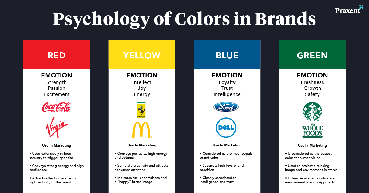
Colors can make people feel certain emotions quickly. For example, red often triggers excitement and energy. Blue can create calm and trust. Yellow feels happy and warm. Green suggests growth and health. These emotional reactions help shape a brand’s identity.
Using colors that match the brand’s message makes it easier for customers to relate. Colors also affect buying decisions by setting the mood. Choosing colors without knowing their emotional impact can confuse customers.
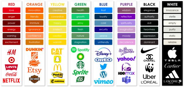
Each color has common meanings recognized worldwide. Red is linked to passion, urgency, and action. Blue is seen as reliable, professional, and peaceful. Yellow often means optimism and friendliness. Green stands for nature, freshness, and safety. Black shows sophistication and power.
Brands use these meanings to create a strong image. For example, tech companies use blue to show trust. Eco-friendly brands choose green for nature. Knowing these meanings helps brands pick colors that fit their values.
Credit: praxent.com
Colors affect how people see a company. They shape feelings and thoughts about a brand. Using color psychology helps businesses create strong connections with their audience. Choosing the right colors can influence how a brand is remembered and trusted.
Colors can send messages without words. They can express energy, trust, or calmness. These signals impact how a brand stands out in a busy market. A smart color choice supports a company’s identity and goals.
Colors make a brand easier to spot. A unique color scheme helps people recall a company quickly. Brands that use consistent colors build stronger recognition over time. Customers link colors to their experiences with the brand. This link improves memory and loyalty.
Colors affect how consumers feel about a brand. Warm colors can create excitement and energy. Cool colors often bring calm and trust. The right color choice shapes opinions about quality and values. This influence guides buying decisions without a single word spoken.
Choosing the right brand colors is a crucial step in corporate branding. Colors create the first impression and influence how people see your company. The right colors can express your brand’s personality and values clearly. They help your brand stand out and connect with the audience emotionally. Understanding color psychology aids in selecting colors that reflect your brand’s core message.
Colors carry meanings that can match your brand’s values. For example, blue often represents trust and professionalism. Green can signal growth and health. Red shows energy and passion. Choose colors that mirror what your company stands for. This creates a consistent and honest brand image. It also helps customers feel confident about your brand.
Knowing your audience’s preferences is key to choosing brand colors. Different groups respond differently to colors. Younger audiences may prefer bright and bold hues. Older customers might like softer, calm tones. Cultural backgrounds also affect color perception. Pick colors that appeal to your target market. This makes your brand more relatable and appealing to them.
Choosing the right color combinations and schemes is vital for effective corporate branding. Colors evoke emotions and influence how people perceive a brand. Using the right combinations creates a strong visual identity that connects with the audience.
Brands can use color schemes to express their values clearly. A well-planned scheme helps maintain consistency across all marketing materials. It also makes a brand more memorable and trustworthy to customers.
Complementary colors sit opposite each other on the color wheel. Using these colors together creates a vibrant and dynamic look. This contrast grabs attention and adds energy to the brand’s design.
Analogous colors are next to each other on the color wheel. They blend well and produce a calm, harmonious feel. This scheme works best for brands that want to appear friendly and approachable.
Choosing between complementary and analogous colors depends on the brand’s personality. Bright contrasts suit bold brands, while soft blends fit gentle, caring brands better.
Visual harmony occurs when colors balance each other well. It makes designs pleasing and easy to look at. Harmony builds trust and keeps customers engaged with the brand.
To create harmony, use a main color with one or two supporting colors. Keep the palette simple and avoid clashing tones. This keeps the brand’s message clear and focused.
Consistent use of harmonious colors strengthens brand recognition. It also helps customers feel more connected and loyal over time.
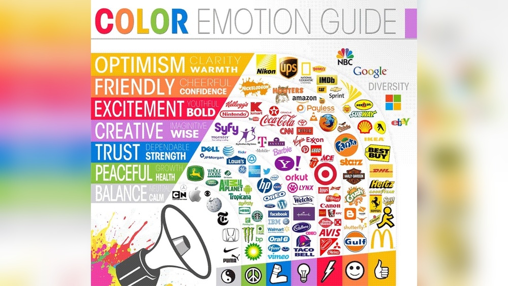
Colors in logos speak loudly about a brand’s identity. They create first impressions that last. A well-chosen color can attract customers and build trust. Logos use colors to convey feelings and values without words. Understanding color psychology helps companies choose the right hues. This choice influences how people see and remember the brand.
Colors trigger emotions and thoughts in the mind. Red often signals energy, passion, and urgency. Blue shows trust, calm, and professionalism. Green connects to nature, health, and growth. Yellow brings warmth, happiness, and attention. Each color shapes how a brand is viewed by its audience. Companies pick colors that match their mission and target market.
Many famous brands use color psychology effectively. Coca-Cola uses red to evoke excitement and energy. Facebook’s blue promotes trust and reliability. Starbucks blends green to reflect growth and freshness. McDonald’s bright yellow grabs attention and feels cheerful. These examples show how color supports brand messages clearly.
Color plays a vital role in marketing materials for corporate branding. It influences how customers feel and react to a brand. Choosing the right colors can make marketing more effective and memorable. Colors can evoke emotions, build trust, and highlight brand identity.
Using color psychology helps businesses connect with their audience. It guides the choice of colors that fit the brand’s message and goals. This approach improves recognition and encourages positive customer responses.
Colors must work well in both print and digital formats. Print materials like brochures, flyers, and business cards need colors that print clearly and attract attention. Digital materials such as websites, social media, and emails require colors that display well on screens.
Choosing colors that look good in both forms ensures a professional appearance. It helps maintain brand quality across different marketing channels. Test colors on various devices and print samples before finalizing them.
Consistency in color use builds strong brand recognition. Using the same color palette in all marketing materials creates a unified brand image. Customers begin to associate those colors with the company’s values and products.
Consistency also makes marketing more efficient. It reduces confusion and strengthens trust. Define clear color guidelines for all teams and partners to follow in every campaign and communication.
Colors carry different meanings in various cultures. These meanings affect how people see a brand. Cultural considerations help brands avoid misunderstandings. They ensure colors send the right message. This is important for companies with customers worldwide.
Choosing colors without cultural knowledge can harm a brand’s image. Colors that look positive in one place might seem negative somewhere else. Brands must study cultural color meanings to connect well with all audiences.
Red means luck and happiness in China. In South Africa, it can symbolize mourning. White is for weddings in the West. In some Asian countries, it stands for death. Blue shows trust in many places. In some Middle Eastern cultures, it protects from evil. These examples show colors do not have one fixed meaning.
Brands should learn local color meanings before choosing them. This knowledge helps avoid sending wrong signals. It builds respect and trust with local customers. Ignoring cultural color meanings can confuse or offend people.
Global brands change colors to fit different markets. They keep core brand identity but tweak colors for local culture. For example, a brand may use green in one country and blue in another. This makes the brand feel familiar and respectful.
Adapting colors also helps brands compete better. Customers prefer brands that understand their culture. Simple color changes can improve brand acceptance and sales. Testing colors with local groups can guide smart choices.
Using cultural knowledge in color psychology is key for success. It creates a strong, positive connection with diverse audiences worldwide.
Measuring the impact of color in corporate branding is essential. It helps companies understand how colors influence customer choices and feelings. By tracking color effects, brands can refine their strategies and improve recognition.
Accurate measurement provides data to support branding decisions. It shows which colors connect best with target audiences. Businesses can then use this insight to boost engagement and loyalty.
Tracking consumer behavior metrics reveals how color affects buying habits. Metrics include click rates, time spent on a page, and purchase frequency. These numbers show if certain colors attract or repel customers.
Surveys and feedback also provide insight into emotional reactions to colors. Brands gather data on feelings and associations linked to their color choices. This helps create stronger emotional connections with consumers.
A/B testing compares two color variations to see which performs better. This method splits audiences randomly, showing different colors to each group. Results reveal which color drives more clicks, sales, or sign-ups.
Testing avoids guesswork and provides clear evidence of color impact. Brands can test logos, buttons, backgrounds, and more. This process ensures color choices align with business goals and customer preferences.
Using color psychology effectively can boost your corporate branding. Avoiding common mistakes helps you connect better with your audience. Poor color choices can confuse customers and weaken your brand image. Learn what to avoid for clear and strong branding.
Using too many colors can overwhelm viewers. A complicated palette makes your brand look messy. Stick to a few key colors that reflect your brand’s personality. Simple palettes create a clean and memorable look. Too many colors also dilute the emotional message you want to send.
Colors affect people differently based on culture and preferences. Ignoring your audience’s feelings about colors leads to poor branding results. Research your target market’s color reactions before choosing your palette. Consider age, culture, and gender for better connection. Using the wrong colors can push customers away instead of attracting them.
Credit: brandingcompass.com
Colors shape how people see brands today and will play a bigger role tomorrow. Corporate branding will keep evolving with new color trends and technologies. Brands that adapt will connect better with their audience and stand out in crowded markets.
Soft and natural colors are gaining popularity. Earthy tones like warm browns, greens, and muted blues create feelings of trust and calm. These colors reflect growing interest in sustainability and wellness.
Bright and bold colors also return in different ways. Neon and electric shades add energy and modernity. Brands use these colors to appear youthful and dynamic.
Pastel colors become a favorite for tech and lifestyle brands. Light pinks, lavenders, and soft yellows feel friendly and approachable. They help brands seem less corporate and more human.
New screen technologies show colors more vividly than before. This opens chances for brands to experiment with vibrant and complex hues. Digital branding uses these colors to catch attention quickly.
Augmented reality (AR) and virtual reality (VR) create immersive brand experiences. Colors in these spaces must be bright and clear to guide users and evoke emotion. This makes color choices even more important.
Artificial intelligence helps analyze which colors perform best for different audiences. AI tools can suggest color palettes based on customer data. This helps brands make smarter, data-driven color decisions.
Color psychology studies how colors influence human emotions and behaviors. In corporate branding, it helps shape brand perception and customer connection through strategic color choices.
Colors increase brand recognition by up to 80%. Consistent use of specific colors makes brands memorable and instantly identifiable to consumers.
Blue and green often evoke trust and reliability. These colors are popular in industries like finance, healthcare, and technology to build customer confidence.
Yes, colors can trigger emotional responses that impact buying behavior. Brands use color psychology to encourage engagement and boost sales effectively.
Choosing the right colors can shape how people see your brand. Colors send quick messages that connect with feelings. Using color psychology helps build trust and recognition. Brands that pick colors carefully stand out in crowded markets. Remember, simple colors often create the strongest impact.
Test different shades to find what suits your brand best. Consistency in color use keeps your brand clear and memorable. Strong colors support your brand’s story without saying a word. Applying color psychology boosts how customers feel about your company.


Leave A Reply Now