


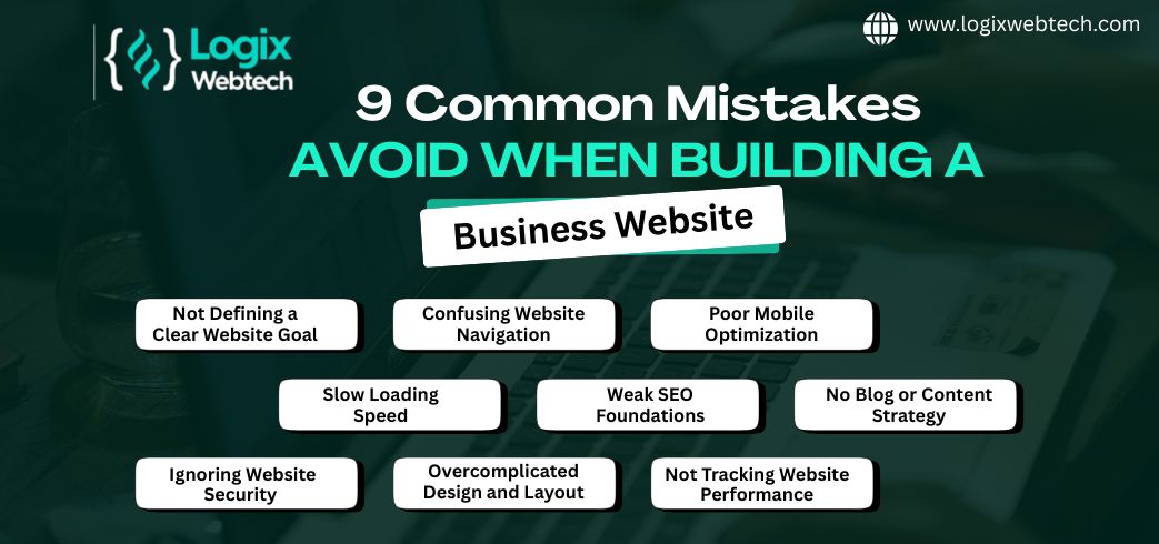
Building a corporate website is a big step for your business, but it’s easy to stumble along the way. You might think having a flashy design or lots of content is enough, but small mistakes can cost you visitors, leads, and even sales.
Are you sure your website is doing everything it should? From slow load times to missing calls to action, these common errors can quietly hold your site back. Keep reading to discover the pitfalls you need to avoid to make your corporate website not just good, but truly effective.
Your online success depends on it.
Missing calls to action (CTAs) is a frequent error in corporate website design. Without clear CTAs, visitors may not know what steps to take next. This confusion can reduce engagement and lower conversion rates. Ensuring your site has strong CTAs guides users and improves overall effectiveness.
CTAs direct visitors to take specific actions. They help turn casual browsers into leads or customers. Clear CTAs improve user experience by simplifying decisions. They also support business goals like sales or newsletter sign-ups. Without CTAs, websites lose valuable opportunities to connect.
Place CTAs where users naturally focus their attention. Common spots include the top of the page, at the end of content, and in sidebars. Use contrasting colors to make CTAs stand out. Avoid clutter near CTAs to keep focus clear. Test different placements to find what works best.
Many sites have CTAs that are hard to find or unclear. Weak or vague wording confuses visitors. Overloading pages with too many CTAs overwhelms users. Sometimes CTAs lead to broken links or irrelevant pages. Ensure every CTA has a clear purpose and works properly.
Ignoring SEO basics can harm your corporate website’s success. Search engines help people find your site. Without proper SEO, your website may stay invisible. Many companies miss simple steps that boost search ranking. This oversight limits traffic and potential customers.
Focusing on SEO fundamentals ensures your website reaches the right audience. It also improves user experience and builds trust. Avoiding SEO basics is a common but costly mistake.
Start with clear page titles and meta descriptions. These show up in search results and attract clicks. Use relevant keywords naturally in titles and content. Add alt text to images for better indexing and accessibility. Create a sitemap so search engines find all pages. Make URLs simple, readable, and keyword-rich. Ensure your website loads fast and works well on mobile devices. These elements form the foundation of solid SEO.
Write content that answers visitors’ questions. Use short sentences and easy words. Break text into small paragraphs and use headings. Include keywords but avoid stuffing them unnaturally. Use internal links to guide users to related pages. Update content regularly to keep it fresh and relevant. Good content helps search engines understand your site and ranks it higher.
Do not copy content from other sites; it hurts rankings. Avoid hidden text or keyword stuffing as search engines penalize them. Prevent broken links and missing images that frustrate visitors. Skip using too many pop-ups or intrusive ads. Do not ignore local SEO if your business serves a specific area. Stay away from slow-loading pages. Fix these issues to keep your SEO strong and your visitors happy.
Slow load times can hurt a corporate website deeply. Visitors expect pages to open fast. If a site loads slowly, many users leave before seeing content. This increases bounce rates and lowers user satisfaction. Search engines also rank slower sites lower. Speed matters for both users and SEO.
Slow websites frustrate users quickly. Visitors may wait only a few seconds before leaving. This reduces engagement and trust in your brand. A slow site can stop customers from making purchases or contacting you. Speed influences how users feel about your company.
Several tools help check website speed easily. Google PageSpeed Insights shows detailed load time scores. GTmetrix provides reports on site performance and suggestions. Pingdom tests site speed from different locations. Use these tools often to track and improve your website.
Optimize images by compressing them without losing quality. Use browser caching to store files temporarily. Minify CSS, JavaScript, and HTML to reduce file sizes. Choose a reliable hosting service with fast servers. Limit the use of heavy scripts and plugins. These steps help your site open faster and keep visitors happy.
Credit: www.logixwebtech.com
Poor navigation frustrates visitors and drives them away quickly. A confusing website makes users lose interest fast. Easy navigation helps visitors find information without hassle. Clear paths keep users engaged and improve user experience.
Organize pages in a simple, logical way. Group related content under clear categories. Avoid deep menus that force many clicks. Keep important pages within two or three clicks from the homepage. A clean structure reduces confusion and improves usability.
Use straightforward labels for menu items. Avoid jargon or complex terms visitors may not understand. Ensure menus stand out and are easy to spot. Make sure menus work well on all devices, including phones. A clear menu guides users directly to what they want.
Do not overload menus with too many links. Limit choices to prevent overwhelming visitors. Use consistent navigation across all pages for familiarity. Highlight current page or section so users know where they are. Clear navigation prevents visitors from feeling lost.
Non-responsive design is a frequent error in corporate websites. It means the site does not adjust well to different screen sizes. Visitors using mobile phones or tablets face difficulties navigating the site. This leads to higher bounce rates and lost business opportunities.
Ignoring responsive design can make a company appear outdated. A website that works only on desktop limits audience reach. Many users now browse the web primarily on mobile devices.
Mobile traffic now makes up over half of all internet visits. Many customers first meet a brand on their phones. A site that works poorly on mobile frustrates visitors quickly. This can cause them to leave and never return.
Mobile users expect fast loading and easy navigation. Slow or cluttered mobile sites lose trust and reduce sales chances. Companies must prioritize mobile-friendly designs to stay competitive.
Responsive design uses flexible layouts and images. It adjusts content based on the screen size automatically. CSS media queries allow different styles for phones, tablets, and desktops.
Simple fonts, clear buttons, and touch-friendly menus improve user experience. Avoid fixed widths that cause horizontal scrolling on small screens. Use scalable images that load quickly without losing quality.
Testing a website on multiple devices is essential. Check how the site looks on various screen sizes and browsers. Use tools like browser simulators and real device testing.
Verify navigation, readability, and load speed on phones and tablets. Fix any issues before launching the site live. Continuous testing keeps the website user-friendly as devices update.

Credit: www.winklix.com
Incomplete contact information on a corporate website damages credibility. Visitors want clear ways to reach your business. Missing or unclear contact details can cause frustration and lost opportunities. A website should provide complete, easy-to-find contact data. This builds trust and encourages communication.
Visitors check contact info to confirm your business is real. Complete information shows transparency and professionalism. It assures users you are available to help or answer questions. Trust grows when contact details are visible on every page. This makes visitors feel confident doing business with you.
Include your phone number, email address, and physical location. Add business hours so visitors know when to reach you. Social media links can also help users connect quickly. Avoid using only a contact form without other details. Complete contact info covers different preferences and builds credibility.
Make the contact page easy to find from any part of the site. Use clear headings and simple language for contact instructions. Add a map if you have a physical office location. Ensure your contact form works properly and sends notifications. Keep the page clutter-free to improve user experience.
Many corporate websites miss key accessibility features. This oversight limits user reach and can hurt your brand reputation. Accessibility means designing your site so everyone, including people with disabilities, can use it easily. Ignoring this leads to lost customers and legal risks.
Accessibility creates equal access for all users. It improves user experience by making navigation simple. Search engines also favor accessible sites, boosting your SEO. Accessibility helps comply with laws that protect disabled users. It shows your company cares about all visitors.
Many websites lack alt text on images, making content invisible to screen readers. Poor color contrast makes text hard to read for some users. Missing keyboard navigation blocks users who cannot use a mouse. Videos without captions exclude hearing-impaired visitors. Complex layouts confuse people with cognitive disabilities.
Start by adding clear alt text to all images. Use high contrast colors for text and backgrounds. Ensure all functions work with keyboard controls. Provide captions and transcripts for videos. Simplify your design for easy reading and navigation. Test your site with accessibility tools regularly.
Using poor stock images can harm your corporate website’s effectiveness. Stock photos often look generic and fail to connect with your audience. They can make your site feel less trustworthy and lower your brand’s appeal. Choosing the right visuals is essential for a strong online presence.
Low-quality stock images give a weak first impression. Visitors may think your business lacks professionalism. Overused images reduce your brand’s uniqueness. People remember visuals more than words. Poor images can cause visitors to leave quickly. Your brand might seem less credible and less valuable.
Select images that match your brand’s style and message. Use high-resolution photos that look clear on all devices. Avoid cliché pictures that appear on many other websites. Authentic and relevant visuals keep visitors interested. Check that images load fast to improve user experience. Quality visuals support your content and boost engagement.
Custom images show your real team, products, and environment. They build trust and tell your unique story. Custom photos require more effort and cost but offer better results. Stock images are easy and cheap but may feel impersonal. Blend custom and quality stock images for balance. Prioritize authenticity to strengthen your corporate website.
Confusing copy creates barriers between your business and potential clients. Visitors leave quickly if they cannot understand your message. Clear, simple language helps users grasp your services and products fast. Avoid long sentences and complicated phrases. Focus on making your message easy to read and remember.
Start with a strong headline that explains what you do. Use short paragraphs and bullet points to break down information. Highlight the main benefits of your offerings clearly. Repeat key points in different ways to reinforce understanding. Use action verbs to encourage visitors to explore more.
Know who your visitors are and what they need. Write copy that answers their questions and solves their problems. Use words your audience uses every day. Avoid general statements that do not connect with specific users. Speak directly to your audience to build trust and interest.
Steer clear of technical terms that confuse readers. Replace jargon with simple, common words. Remove unnecessary details that do not add value. Keep sentences short and to the point. A clean, clear message helps visitors stay and learn about your business.

Credit: www.getblend.com
Ignoring analytics is a critical error in building a corporate website. Many businesses create a site but fail to track how visitors interact with it. Without analytics, understanding user behavior becomes guesswork. This lack of insight stops you from making informed decisions to improve your website’s performance. Analytics provide data that shows what works and what does not. Skipping this step can lead to missed opportunities for growth and engagement.
Tracking user behavior means collecting data on how visitors use your site. It shows which pages get the most views and where users drop off. You can see how long people stay and what actions they take. This information helps identify strengths and weaknesses in your website. Setting up tools like Google Analytics is simple and gives valuable insights. Without tracking, you miss a clear picture of your visitors’ journey.
Data from analytics guides website improvements. It helps you understand what content attracts visitors and what confuses them. Use this data to optimize page layout, improve navigation, and speed up load times. Analytics can reveal which marketing campaigns drive traffic. Adjust your strategy based on real user data instead of assumptions. This leads to better user experience and higher conversion rates.
Many websites collect data but fail to use it correctly. One mistake is setting up analytics improperly, causing inaccurate reports. Another is ignoring key metrics like bounce rate or session duration. Some businesses collect data but never analyze it regularly. Avoid focusing only on total traffic without looking deeper. Regular review and action on analytics data are essential to avoid these pitfalls.
Poor navigation confuses visitors and increases bounce rates. Avoid cluttered menus, unclear labels, and deep navigation structures. Ensure menus are simple, intuitive, and accessible on all devices for better user experience and engagement.
Slow load times frustrate users and harm SEO rankings. Optimize images, use caching, and minimize code to improve speed. Fast websites increase user retention and conversion rates significantly.
Without clear calls to action (CTAs), users may not know the next steps. Effective CTAs guide visitors towards desired goals like contacting or purchasing. Always place visible and compelling CTAs on key pages.
Most users access websites via mobile devices. A non-responsive design leads to poor user experience and lost leads. Responsive design adapts content for all screen sizes, boosting accessibility and SEO performance.
Avoiding common website mistakes improves user experience and boosts credibility. Fast loading times keep visitors engaged. Clear navigation helps users find information quickly. Mobile-friendly designs reach more people. Strong calls to action guide visitors effectively. Complete contact details build trust.
Use original images that reflect your brand well. Focus on basic SEO to increase visibility. Regularly check your site for errors and updates. Small changes make a big difference in success. Stay simple, clear, and user-focused for best results.


Leave A Reply Now