


If you want your course to truly connect with learners, you need to meet them where they are—on their mobile devices. Mobile-first course design isn’t just a trend; it’s a game-changer.
When you design with mobile users in mind from the start, you create learning experiences that are clear, engaging, and easy to follow, no matter the screen size. Imagine your learners accessing your content anytime, anywhere, without frustration or distraction.
You’ll discover why mobile-first design matters more than ever and learn simple, practical steps to build courses that captivate your audience right from their phones. Ready to transform your course and boost learner success? Let’s dive in.
Mobile-first design basics form the foundation of effective course creation today. This approach starts with designing for the smallest screen first. It ensures content looks great and works well on mobile devices. Many learners use phones or tablets to access courses. Prioritizing mobile improves their learning experience and engagement.
Mobile-first means designing for mobile devices before desktops. It focuses on smaller screens and touch controls. Designers create a simple, clear layout that fits mobile screens perfectly. This method makes sure essential content is easy to find and use. Features that work well on phones get built first. Larger screens get extra details added later.
Responsive design starts with desktop views and adapts to smaller screens. Mobile-first design flips this process. It begins with mobile needs and builds up to desktop versions. Mobile-first often leads to faster, cleaner courses on phones. Responsive design can sometimes add complexity by shrinking desktop layouts. Mobile-first creates a smoother experience for mobile users.
Credit: www.wired.com
Designing courses with a mobile-first approach is essential today. Most learners use smartphones or tablets to access educational content. Ignoring mobile users can limit your course’s effectiveness and reach. Mobile-first course design ensures your lessons work well on small screens first. This method creates a smooth learning experience for everyone.
Mobile-first design focuses on the devices learners use most. It makes content easy to read on small screens. Navigation becomes simple and intuitive. Learners can study anytime and anywhere without trouble. This approach respects different learning styles and preferences. It helps learners stay focused and complete courses faster.
Courses designed for mobile devices keep learners interested. Quick loading times and clear layouts reduce frustration. Interactive elements work well on touchscreens. Accessibility features like larger buttons and readable fonts help all users. Mobile-friendly courses support learners with disabilities better. This creates a more inclusive learning environment for everyone.
Search engines favor mobile-optimized content. Mobile-first courses rank higher in search results. This increases visibility and attracts more learners. A wider audience finds your course, including those using mobile devices only. Good SEO helps your course grow without extra advertising. Mobile-first design boosts your course’s success and reach.
Core principles guide mobile-first course design. They help create courses that work well on small screens. These principles focus on clarity, usability, and speed. Following them improves learner engagement and satisfaction.
Designing for mobile means thinking about limited space and touch interaction. It requires careful planning of content, navigation, and visuals. Each element must support easy access and quick understanding.
Content must be clear and concise. Show the most important information first. Avoid long paragraphs and extra details. Use headings and bullet points to break text. This helps learners find key points fast.
Focus on essential concepts and skills. Remove anything that distracts or confuses. Keep content relevant to course goals. Mobile screens need simple and direct content to keep learners focused.
Navigation should be easy to use with fingers. Use large buttons and clear labels. Avoid deep menus or complex paths. Keep navigation consistent on every page.
Use a simple menu with few options. Provide clear ways to move forward or back. Quick access to main sections improves the learning flow. Mobile users benefit from fast, smooth navigation.
Visuals must load quickly and display clearly on small screens. Use images and icons that support the content. Avoid heavy graphics that slow down the course.
Use high-contrast colors for text and backgrounds. Make buttons and links easy to see and tap. Design visuals to fit well on mobile without zooming or scrolling sideways.

Credit: funtech.co.uk
Implementing mobile-first course design requires careful steps. Each step ensures the course works well on small screens first. Then, it adapts smoothly to larger screens. Follow these steps to create effective mobile-friendly courses.
Begin by designing your course layout for small screens. Focus on key content and easy navigation. Remove any clutter that can distract learners. Use simple menus and clear buttons for touch use. Plan the flow to fit vertical scrolling. This approach helps prioritize what learners see first.
Use flexible layouts that change with screen size. Avoid fixed widths; use percentages or relative units instead. Choose fonts that are easy to read on small devices. Increase font size for headings and body text. Keep line spacing wide to improve readability. Balance text and images to avoid crowding.
Compress images and videos to reduce file size. Use modern formats like WebP for faster loading. Limit the use of large files that slow down mobile users. Enable lazy loading to delay off-screen media. Consider using audio or text alternatives for video content. Fast load times keep learners engaged and reduce drop-off.
Test your course on various devices and screen sizes. Check functionality on smartphones, tablets, and desktops. Use browser developer tools to simulate different screens. Verify touch controls work smoothly and links are easy to tap. Fix any layout breaks or slow loading issues. Regular testing ensures a consistent user experience.
Choosing the right tools and technologies is key for effective mobile-first course design. These tools help create responsive, user-friendly courses that work well on small screens. They simplify coding, design, and testing to ensure a smooth learning experience on mobile devices.
CSS plays a big role in mobile-first design. Use media queries to adjust styles based on screen size. Start with simple, clean styles for small screens. Then add more complex styles for larger screens. Flexbox and grid layouts help arrange content neatly. Use relative units like em and rem for scalable text. Avoid fixed widths that break layouts on small devices.
Frameworks speed up mobile-first course development. Bootstrap offers ready-made components that adapt to screen size. Foundation provides flexible grid systems and UI elements. Tailwind CSS gives utility classes for fast styling. Libraries like React Native help build mobile apps with a web-like approach. These tools save time and ensure consistency across devices.
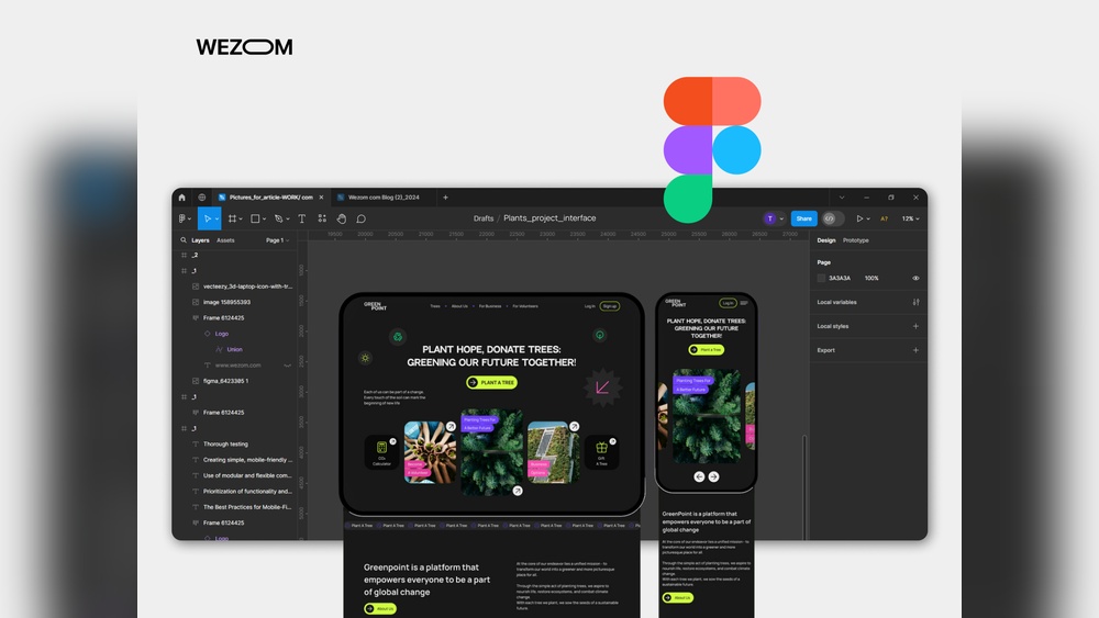
Design tools like Figma and Adobe XD allow creating mobile layouts easily. They support prototypes to test user flow on phones. Testing tools check responsiveness on multiple devices. Browser developer tools simulate screen sizes and resolutions. Services like BrowserStack enable real device testing online. Regular testing avoids surprises and improves course usability on mobiles.
Designing courses for mobile devices brings unique challenges. These challenges affect how learners interact with content and tools. Addressing them is key to creating effective mobile-first courses.
Mobile screens are small and limit space for content. Designers must simplify course elements without losing important features. Too much detail can overwhelm learners on mobile. Too little can reduce engagement and learning value. The goal is to keep the design clear and useful.
Many courses have old content made for desktops. Adapting this content for mobile needs effort and care. Images, videos, and layouts may not work well on small screens. Updating or redesigning this content ensures learners get a smooth mobile experience. Ignoring legacy content can cause frustration and dropouts.
Learners often switch devices during a course. The course should look and work well on phones, tablets, and desktops. Consistency helps learners focus on the material, not the interface. Creating a seamless experience across devices builds trust and improves learning outcomes.
Exploring real examples and case studies helps us understand mobile-first course design better. These stories show how thoughtful design improves learning on small screens. They highlight practical steps and clear results. This section shares successful courses and insights from top platforms. These examples inspire course creators to build better mobile experiences.
Many courses designed with mobile users in mind achieve great engagement. For example, a language learning app simplified lessons for small screens. It used short videos and interactive quizzes that work well on phones. Learners could study anytime without zooming or scrolling too much.
Another case is a coding bootcamp that redesigned its curriculum for mobile devices. They broke lessons into brief modules with easy navigation. This change boosted course completion rates and learner satisfaction. The design focused on touch-friendly buttons and clear fonts.
Popular platforms like Coursera and Udemy follow mobile-first principles. Coursera uses responsive design so content adapts smoothly to different devices. It offers downloadable materials for offline study, helpful for mobile learners.
Udemy emphasizes quick loading times and simple layouts. Their mobile app supports video playback with adjustable speed. Learners appreciate the ability to switch between devices without losing progress. These platforms show that mobile-first design means enhancing usability and access.

Credit: www.thelearning-lab.com
Adopting best practices in mobile-first course design ensures learners have a smooth experience. Thoughtful design helps courses load faster and work well on all devices. Following simple rules improves engagement and learning outcomes.
Keep the design simple and clean. Use only necessary elements on each screen. Avoid clutter that distracts learners from the main content. Focus on clear text and easy navigation. Minimalism helps courses load quickly and look good on small screens.
Make buttons and links easy to tap with fingers. Use large, clear fonts for reading on mobile devices. Include interactive elements like quizzes and videos that work well on phones. Feedback should be instant to keep learners motivated. Interaction improves attention and retention.
Test your course on different mobile devices regularly. Collect feedback from learners about usability and content. Use analytics to find where learners struggle or drop off. Update and improve the course based on real data. Continuous changes keep the course relevant and effective.
Mobile-first course design means creating learning materials optimized for mobile devices first. It ensures accessibility and usability on small screens, enhancing learner engagement and convenience.
Mobile-first design matters because most learners use smartphones. It improves user experience, accessibility, and course completion rates by adapting content to smaller screens effectively.
Begin by designing for small screens with simple navigation. Prioritize essential content, optimize images, and test on various mobile devices to ensure smooth interaction.
Benefits include increased learner engagement, wider accessibility, faster loading times, and better adaptability across devices. It aligns courses with modern learning habits and technology use.
Mobile-first course design improves learning on all devices. It keeps content clear and easy to navigate. Designing for small screens first helps focus on key ideas. This method ensures courses work well anywhere, anytime. By prioritizing mobile users, you reach more learners effectively.
Start simple, then add features for larger screens. Mobile-first design builds better, more accessible learning experiences. Try this approach to make your courses user-friendly and engaging.


Leave A Reply Now