


Your corporate website is often the first place potential clients, partners, or investors visit. If they struggle to find what they need quickly, you risk losing their interest—and their business.
That’s why mastering navigation best practices is crucial. When your website’s navigation is clear, intuitive, and user-friendly, you guide visitors effortlessly to key information and calls to action. You’ll discover simple yet powerful strategies to optimize your corporate website navigation.
By applying these tips, you’ll improve user experience, boost engagement, and make every visit count. Ready to transform your website navigation into a tool that works for you? Let’s dive in.
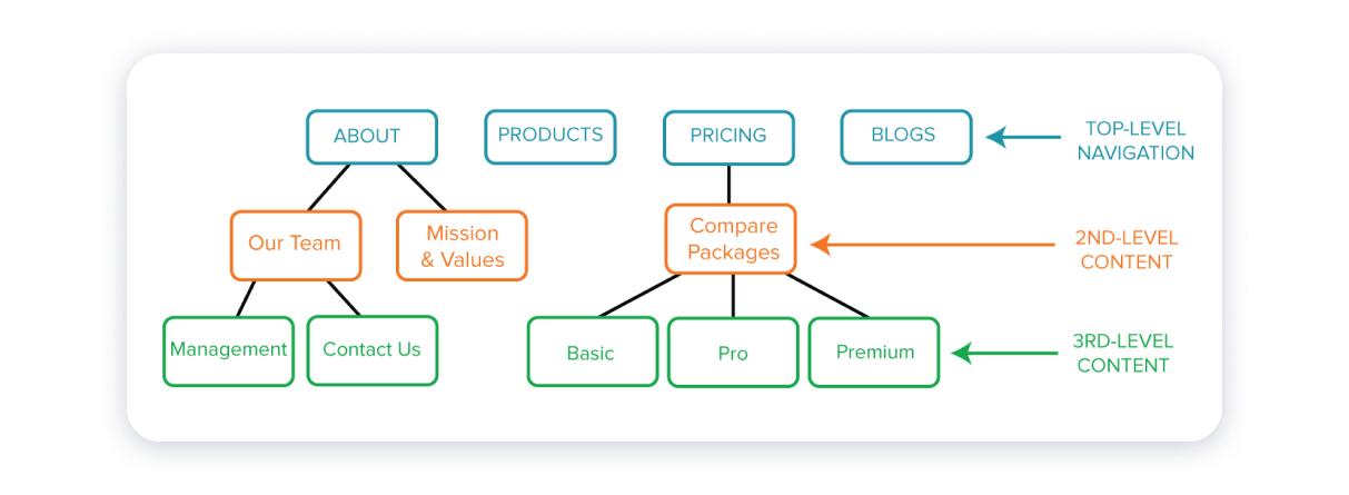
Navigation structure forms the backbone of any corporate website. It guides visitors through your content and helps them find information quickly. A clear and logical navigation structure reduces confusion and improves user experience. Well-planned navigation keeps users engaged and lowers bounce rates. It also benefits your SEO by making your site easier to crawl and index.
Start by mapping out your website’s pages in a sitemap. The sitemap shows the overall layout and how pages connect. Organize pages to reflect your business priorities. Include main sections like About, Services, Products, and Contact. A simple sitemap helps you visualize user paths. It ensures no important pages get lost or buried deep.
Group related content under clear categories. Use a top-down approach with broad topics first. Then break them into smaller, specific subtopics. This hierarchy helps users understand your site structure. It also supports search engines in identifying key pages. Keep labels short and descriptive for easy scanning.
Avoid deep menu layers that confuse users. Limit your menus to two or three levels max. Deep menus force users to click many times to find information. Shallow menus improve navigation speed and reduce frustration. Make sure each menu level has a clear purpose and relevant links.
Menu design plays a crucial role in how visitors explore a corporate website. A well-designed menu guides users to find information quickly. It should be simple, clear, and easy to navigate. A confusing menu can frustrate users and increase bounce rates. Keeping menus user-friendly boosts engagement and improves overall site experience.
Good menu design balances aesthetics with functionality. It helps users understand the structure of your website at a glance. Each menu item should serve a clear purpose. Thoughtful menu design supports both new visitors and returning users in finding content efficiently.
Menu labels must be straightforward and easy to understand. Avoid jargon and technical terms that might confuse users. Use common words that describe the page content clearly. For example, use “About Us” instead of “Company Info.” Clear labels reduce guesswork and improve navigation speed.
Adding short descriptions under menu items helps users know what to expect. Descriptive text clarifies the purpose of each link. It works well for complex menus with multiple categories. Keep descriptions brief and relevant to maintain a clean design.
Dropdown menus often hide important links and confuse users. They can be difficult to use on mobile devices. Instead, show key options clearly in a visible menu bar. Simple menus improve usability and reduce navigation errors.
Highlighting the current page in the menu helps users know where they are. Use a different color or underline to mark the active menu item. This visual cue reduces confusion and enhances the browsing experience. Users appreciate knowing their exact location on the site.
Navigation features shape how visitors explore your corporate website. Clear, simple navigation helps users find what they need fast. Well-designed features reduce confusion and keep visitors engaged. They guide users through your content smoothly and efficiently.
A search bar lets users quickly locate specific information. It saves time by avoiding endless clicking. Place it visibly at the top of the page for easy access. Make sure the search function works well and returns relevant results. A good search bar improves user satisfaction and keeps visitors on your site longer.
Breadcrumbs show users their current location within the site’s structure. They provide a clear path back to previous pages or categories. This feature helps users avoid getting lost. Breadcrumbs improve navigation flow and support better site organization. They are especially useful on large sites with many pages.
Sticky menus stay visible as users scroll down the page. This constant presence allows quick access to navigation links at any time. Sticky menus reduce frustration and improve the browsing experience. They help users move between sections without scrolling back up. Use sticky menus to keep navigation handy and simple.
Calls to action (CTAs) guide users toward important actions on your site. They use clear, direct language like “Contact Us” or “Learn More.” CTAs stand out visually and invite clicks. Proper placement of CTAs drives engagement and supports your business goals. Strong CTAs turn visitors into leads or customers.
Credit: weblium.com
Mobile optimization is crucial for corporate websites. Many users access sites using smartphones or tablets. A seamless navigation experience on small screens improves user satisfaction. It also reduces bounce rates and boosts engagement. Mobile-friendly navigation helps visitors find information quickly and easily. This section highlights best practices to optimize navigation for mobile devices.
Small screens need clear and simple navigation. Limit the number of menu items to avoid clutter. Use concise labels that describe each section well. Group related links to create an organized menu structure. Avoid complex dropdowns that are hard to use on mobile. A clean design helps users focus on key content.
Responsive menus adapt to different screen sizes automatically. They adjust layout and style for smartphones and tablets. Hamburger menus are popular for saving space on mobile. Ensure menus open smoothly and close easily. Responsive design keeps navigation accessible on all devices. This approach improves user experience and site usability.
Touch-friendly elements make navigation easier on mobile. Use large buttons and links with enough space around them. Small tap targets cause frustration and errors. Avoid tiny text or crowded links that are hard to press. Include clear visual feedback when users tap items. This practice increases accuracy and speed of navigation.
Visual design plays a key role in corporate website navigation. It guides users smoothly through the site. Clear visuals reduce confusion and improve user experience. Simple, clean design helps visitors find what they need fast.
Good visual design balances elements on the page. It makes navigation intuitive and pleasant. Careful use of space, style, fonts, and colors supports easy reading and clicking. These factors keep visitors engaged and encourage exploration.
White space separates navigation items clearly. It prevents clutter and highlights important links. Using space wisely makes menus easier to scan. It also reduces eye strain and improves focus.
White space around buttons and text helps users click accurately. It creates a neat, organized look. Avoid cramming too many items close together. Let each element breathe for better clarity.
Keep navigation elements uniform across the website. Consistent fonts, colors, and sizes build trust and familiarity. Users quickly learn how to interact with menus.
Consistent styling reduces confusion and speeds up navigation. Use the same button shapes and hover effects. Match link styles and spacing on all pages. This creates a smooth, cohesive experience.
Choose readable fonts that suit your brand and audience. Avoid overly decorative or small fonts. Clear typography helps users scan navigation items easily.
Use colors that contrast well with the background. High contrast improves visibility and accessibility. Apply brand colors to highlight key links. Keep the color palette simple to avoid distractions.
The footer navigation is a key part of any corporate website. It appears at the bottom of every page. Visitors often use it to find important information quickly. A well-organized footer helps users navigate without confusion. It also supports SEO by linking to valuable pages. The footer is a place for secondary links, contact details, and social media profiles. These elements build trust and keep visitors engaged longer.
Secondary links guide users to less prominent but useful pages. Examples include privacy policy, terms of service, and FAQs. These links free up space in the main menu. They also help users find detailed information easily. Group these links logically for easy scanning. Use simple text that clearly describes each page.
Contact information in the footer boosts credibility. Include your company’s phone number and email address. Adding a physical address helps local visitors trust your business. Keep this info visible and easy to find. Some sites also add business hours for convenience. This simple step encourages visitors to reach out.
Social media links connect your website to your online presence. Icons should be clear and consistent in style. Place them in a visible spot within the footer. Visitors appreciate easy access to your social channels. This helps increase followers and engagement. Only include active accounts to maintain professionalism.
Accessibility is vital for corporate website navigation. It ensures every visitor can use the site easily. This improves user experience and broadens your audience. Accessibility also meets legal standards and ethical practices.
Incorporate features that assist users with disabilities. Design navigation that works well with different devices and tools. Focus on clear, simple, and consistent navigation elements. This section covers three key accessibility practices.
Many users rely on keyboards instead of mice. Make sure navigation can be controlled using keyboard keys. Use the Tab key to move through links and buttons logically. Highlight the focused element clearly to guide users. Avoid keyboard traps where users get stuck.
ARIA landmarks help screen readers understand page structure. Add roles like navigation, main, and banner to sections. This lets users jump directly to key areas. Proper ARIA use improves navigation speed and clarity for assistive devices.
Text and background colors must have strong contrast. This helps users with low vision or color blindness. Follow WCAG guidelines for contrast ratios. Use tools to check color contrast before finalizing design. Clear contrast improves readability and reduces eye strain.
Credit: www.sliderrevolution.com
Corporate websites often struggle with navigation issues that frustrate users. Simple mistakes can make it hard for visitors to find important information. Identifying common errors helps improve user experience and site effectiveness.
Below are some frequent navigation mistakes seen on corporate websites. Avoiding these can boost clarity and user satisfaction.
Many websites include too many items in their menus. This overwhelms visitors and makes choices confusing. A crowded menu reduces focus and slows down navigation. Keep menus simple and limit the number of links. Group related items to create clear categories. This helps users quickly find what they need.
Menu labels must be clear and specific. Vague titles like “Services” or “Products” do not guide users well. Use descriptive words that explain what users will see next. For example, use “Cloud Solutions” instead of just “Services.” Clear labels reduce guesswork and improve navigation speed. They also help search engines understand your content better.
User feedback is valuable for improving navigation. Some sites never ask visitors about their experience. Others ignore the feedback they receive. Regularly collect and analyze user opinions to spot navigation problems. Test your menu with real users to find confusing parts. Adjust navigation based on feedback to make it more user-friendly. This approach increases visitor satisfaction and engagement.
Engagement boosters play a key role in making corporate website navigation effective. They keep visitors interested and encourage them to explore more pages. A well-designed navigation system helps users find what they need quickly. This leads to longer visits and higher chances of conversion.
Interactive elements make navigation lively and user-friendly. Features like hover effects, animated menus, and clickable icons catch users’ attention. These elements provide immediate feedback, helping users know where they are on the site. Interactive navigation also makes browsing fun and less frustrating.
Action-oriented words guide visitors clearly toward the next step. Labels like “Get Started,” “Browse Products,” or “Contact Us” tell users what to do. These words create a sense of urgency and encourage clicks. Clear, simple language in navigation reduces confusion and speeds up decision-making.
Regular testing ensures navigation works smoothly for all users. Check for broken links, slow-loading menus, and confusing layouts. Use feedback from real users to find issues and improve navigation. Testing on different devices helps maintain a consistent experience everywhere.

Credit: www.brafton.com
Key elements include a clear menu, descriptive labels, search bar, and breadcrumb trails. These improve user experience and help visitors find information quickly.
Mobile optimization ensures menus are easy to use on small screens. Responsive design and simplified navigation prevent frustration and keep users engaged on mobile devices.
Descriptive labels guide users effectively by clearly indicating page content. They reduce confusion and improve site usability, leading to better user satisfaction and SEO performance.
Breadcrumbs show users their current location within the website hierarchy. They enhance navigation by allowing easy backtracking and improving overall site structure visibility.
Clear and simple navigation helps visitors find information fast. Use easy words for menu items and keep menus short. Include a search bar and show users where they are on the site. Mobile-friendly design is key for all devices. Test your navigation often to fix any issues.
Good navigation improves user experience and keeps visitors engaged. Following these practices makes your corporate website easy to use and professional.


Leave A Reply Now