


Your agency’s website is more than just a digital business card—it’s your strongest tool to attract and convert clients. But what if your site isn’t turning visitors into customers like it should?
That’s where smart design, clear user experience (UX), powerful copywriting, and a solid conversion rate optimization (CRO) strategy come in. In this guide, you’ll discover how to create a high-converting agency website that grabs attention, keeps visitors engaged, and motivates them to take action.
Keep reading, and you’ll learn simple yet effective ways to turn your website into a lead-generating machine.
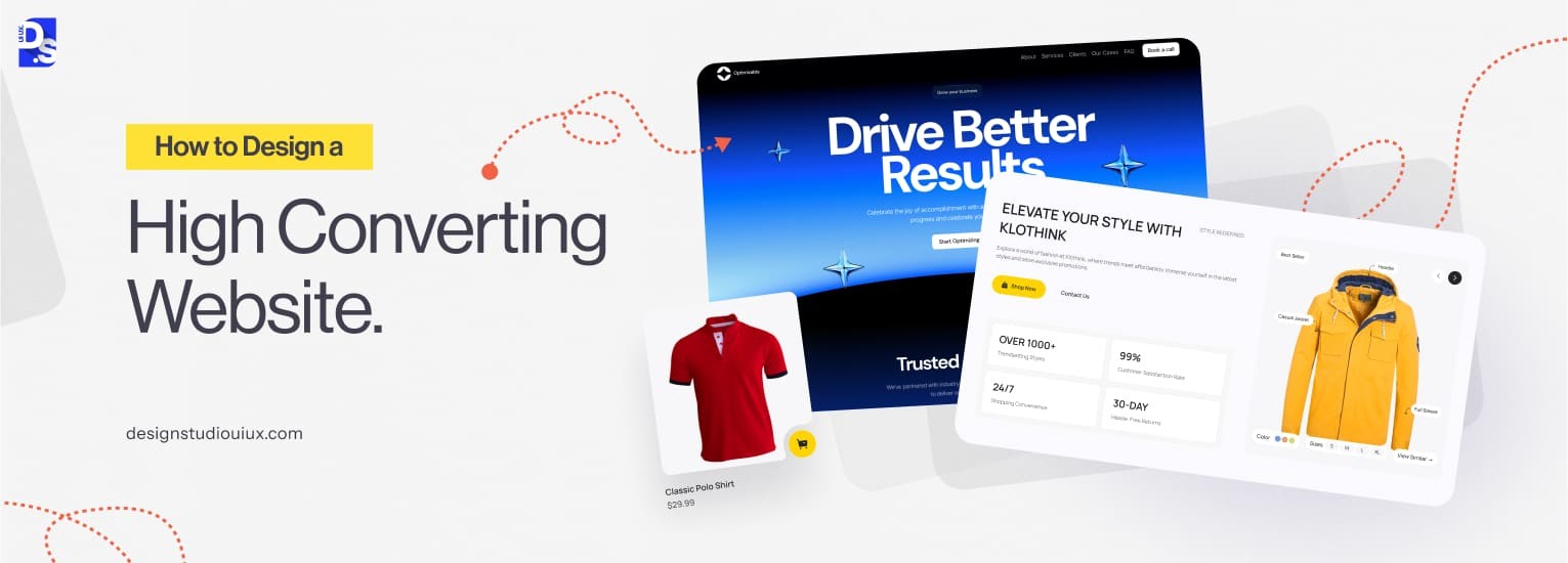
Credit: www.designstudiouiux.com
High-converting agency websites need smart design, clear UX, sharp copywriting, and solid CRO strategies. In 2026, website layouts focus on simplicity, speed, and user engagement. The right layout guides visitors smoothly toward action. Clear sections, easy navigation, and trust signals boost conversions. Let’s explore the best agency website layouts that convert in 2026.
Minimalism reduces distractions and highlights key messages. Use plenty of white space to separate content. Strong, bold calls-to-action (CTAs) stand out. Visitors find what they need fast. This layout suits agencies wanting a professional, clean look.
Agencies thrive on showing past work. A grid layout arranges portfolio pieces neatly. Visitors scan projects quickly, increasing interest and trust. Each project links to a detailed case study or page.
Storytelling engages visitors emotionally. Interactive elements keep users curious and involved. Scroll-triggered animations or videos explain agency values and success stories.
| Feature | Benefit |
|---|---|
| Scroll animations | Enhances engagement |
| Video backgrounds | Shows agency personality |
| Step-by-step storytelling | Builds trust and clarity |
Split-screen divides the page into two parts. One side shows images or graphics. The other side explains services or benefits. This layout balances visuals and text well.
One-page sites improve user flow. Visitors scroll down through sections in order. This layout suits agencies with concise content and clear funnels.
Writing conversion-optimized copy for agency websites is key to turning visitors into clients. The words on your site should be clear, direct, and focused on what your audience needs. Good copy builds trust and guides visitors to take action. This section shows simple ways to write copy that sells.
Know who visits your site. Learn their problems and what they want. Use simple questions to gather this info:
Use their words in your copy. This makes your message feel personal and clear.
Headlines grab attention. Make them simple and benefit-driven. Focus on what visitors gain. For example:
| Poor Headline | Better Headline |
|---|---|
| Welcome to Our Agency | Grow Your Business with Expert Marketing Help |
| Our Services | Boost Sales with Custom Digital Solutions |
Write short sentences that are easy to read. Avoid jargon or complex terms. Break long ideas into smaller parts.
This helps visitors understand your message fast.
Visitors want to know how your agency helps them. Show clear benefits instead of just listing services.
For example, say “Increase your sales by 30%”, not just “We provide SEO services.”
Guide visitors to take the next step. Use clear and active CTAs like:
Place CTAs where visitors can easily see them, such as at the end of sections or near contact info.
Creating a high-converting agency website means paying close attention to design, user experience (UX), copywriting, and conversion rate optimization (CRO). One of the most important parts is your service page. This page needs to rank well on search engines and attract potential clients. The Service Page SEO Checklist focuses on three main areas: structure, keywords, and content depth. Each plays a key role in making your page easy to find and useful for visitors.
A well-structured service page guides visitors smoothly through your offerings. Use clear headings and subheadings with proper HTML tags. Organize content into sections like benefits, features, and pricing.
Good structure helps search engines understand your page. It also improves user experience by making information easy to find.
Select keywords that match what potential clients search for. Use tools like Google Keyword Planner or Ubersuggest to find relevant terms. Include keywords naturally in titles, headings, and throughout the content.
Balance keyword use to avoid stuffing. Natural flow improves readability and SEO.
Thorough content builds trust and authority. Cover all important aspects of your service with clear explanations. Use examples, benefits, and answers to common questions.
| Content Element | Purpose | Tips |
|---|---|---|
| Service Description | Explain what you offer | Keep it clear and simple |
| Benefits | Show value to clients | List key advantages |
| FAQs | Answer common questions | Use simple language |
| Case Studies or Examples | Prove effectiveness | Include real results |
Rich content keeps visitors engaged longer. It also signals search engines that your page is valuable.
Creating a strong “About Us” page is vital for any agency website. This page helps visitors understand your story, values, and why they should trust you. A well-written “About Us” page can turn casual visitors into loyal clients. It should clearly explain who you are and what makes your agency different. Trust builds when visitors feel connected with your mission and team.
Start by telling your agency’s story in simple words. Explain how your agency began and what drives your work. Use short sentences and focus on the key moments that shaped your company.
Keep the story honest and real. Avoid jargon or complicated terms.
People trust people. Show the faces behind your agency. Add photos and short bios of key team members. Mention their skills and roles clearly.
Humanize your brand to create stronger trust.
Write in a way that anyone can understand. Avoid complex words and long sentences. Be honest about what your agency can and cannot do.
| Good Practice | What to Avoid |
|---|---|
| Simple, clear words | Technical jargon |
| Short sentences | Long, confusing sentences |
| Honest claims | Overpromising results |
Add testimonials, client logos, or case studies to prove your agency’s value. Social proof helps visitors feel confident in your work.
Trust grows with proof. Don’t just say it, show it.
Adding social proof is a powerful way to build trust and boost conversions on your agency website. Social proof includes testimonials, reviews, and trust badges. These elements show visitors that others have had positive experiences with your services. This reassurance helps turn visitors into clients.
Testimonials are direct quotes from happy clients. They add a personal touch and show real satisfaction.
Reviews provide a broader view of your agency’s reputation. They come from multiple clients, often in star ratings or short comments.
Trust badges signal security and professionalism. They reassure visitors about your agency’s reliability.
| Type of Badge | What It Shows | Where to Place |
|---|---|---|
| Security Badge | Safe browsing and payment | Footer, checkout page |
| Industry Certification | Expertise and standards | About page, homepage |
| Partner Logos | Trusted collaborations | Homepage, sidebar |
Place badges in visible spots without cluttering the page. Balance trust signals with clean design.
Chatbot vs Human Support: Which Works Best for Agencies? This question often arises when agencies build their websites. Both chatbots and human support have their own strengths and weaknesses. Choosing the right option affects how visitors feel and how many become clients. Let’s explore how each one works for agencies and which might suit your needs best.
Benefits of Using Chatbots for Agencies
Advantages of Human Support for Agencies
Key Differences Between Chatbots and Human Support
| Aspect | Chatbots | Human Support |
|---|---|---|
| Response Speed | Instant | Minutes to hours |
| Cost | Lower | Higher |
| Handling Complexity | Basic tasks | Complex issues |
| Availability | 24/7 | Business hours |
| Personalization | Limited | High |
Choosing the Best Support Approach for Your Agency
Consider your agency’s goals and client needs before deciding. A mix of both chatbots and human agents often works best.
Tips to Improve Support Experience on Agency Websites
Every agency website needs strong call-to-action (CTA) buttons to bring in leads. CTA optimization means creating buttons and links that visitors want to click. This process directly impacts your lead generation and sales. Small changes in CTAs can make a big difference. Let’s explore what truly increases leads through smart CTA design and strategy.
CTAs guide visitors toward a specific action. This could be filling out a form, signing up for a newsletter, or requesting a quote. Clear CTAs reduce confusion and help users know the next step.
Visuals grab attention quickly. Design your CTAs so they stand out but fit your website style.
| Design Element | Best Practice | Why It Works |
|---|---|---|
| Color | Use contrasting colors | Makes CTA pop against background |
| Size | Big enough to notice, not too large | Easy to spot without cluttering |
| Shape | Rounded corners or buttons | Invites clicks and looks modern |
| Whitespace | Leave space around CTA | Reduces distractions, highlights CTA |
Words matter for CTAs. Strong copy creates urgency and clarity.
Where CTAs appear affects clicks. Place CTAs where visitors spend the most time.
Testing different CTAs helps find what works best. Use A/B testing to compare versions.
| Test Element | Example | What to Measure |
|---|---|---|
| Button Color | Blue vs. Green | Click-through rate (CTR) |
| Copy Text | “Get Your Free Quote” vs. “Request a Quote” | Conversion rate |
| Button Placement | Top of page vs. Bottom of page | User engagement |
Regularly check analytics to improve CTAs over time.
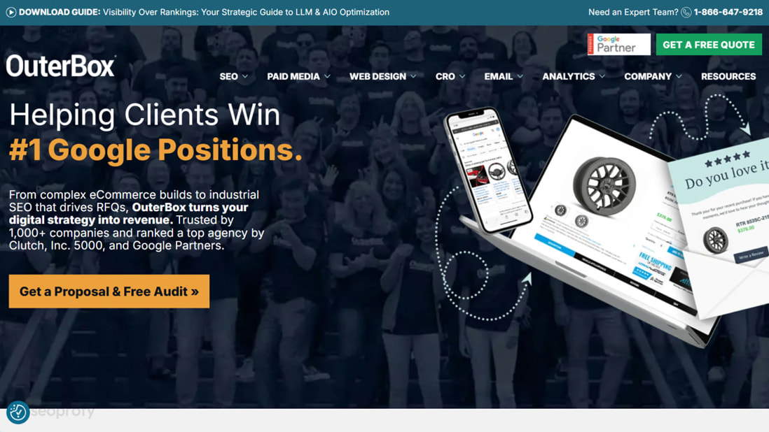
Credit: seoprofy.com
Lead forms are a key tool for agencies to collect contact details and start conversations. Designing simple forms encourages more visitors to fill them out. Complex or long forms scare users away. This section shows how to create easy, clear, and effective lead forms that increase submissions.
Only ask for essential information. Each extra field reduces the chance of form completion.
Use optional fields sparingly. The shorter the form, the better the conversion.
Labels must be easy to read and understand. Avoid jargon or complex terms.
Clear labels reduce confusion and speed up form filling.
Show errors clearly and immediately after users submit incorrect data.
Instant feedback helps users fix mistakes without frustration.
Most visitors use phones. Forms must work well on small screens.
Mobile-friendly forms increase completion rates significantly.
The submit button should stand out and tell users what happens next.
Try different versions to find what works best.
| Test Element | Example | Goal |
|---|---|---|
| Number of Fields | 3 fields vs. 5 fields | Higher submission rate |
| Button Text | “Submit” vs. “Get Your Free Quote” | Clearer call to action |
| Error Messages | Generic vs. specific messages | Lower form abandonment |
Collect data and improve forms regularly for better results.
Adding a portfolio, case studies, and proof to an agency website boosts trust and helps visitors decide quickly. These elements show real results and past work, making your agency stand out. Using them the right way guides visitors to take action and increases conversion rates.
Select projects that best represent your skills and services. Focus on quality over quantity. Show diverse work to appeal to different clients.
Keep the portfolio updated with recent and relevant projects. Avoid cluttering with too many items.
Case studies tell a story about your work and results. Break them into clear sections to keep readers engaged.
Use images and charts to make case studies visually appealing and easy to understand.
Proof includes testimonials, reviews, awards, and certifications. Place them where visitors notice quickly.
Proof should feel genuine and relevant to your audience. Avoid overloading pages with too much proof.
Credit: vitaldesign.com
Improving website speed and mobile experience plays a crucial role in creating a high-converting agency website. Fast loading pages keep visitors interested and reduce bounce rates. A smooth mobile experience helps users navigate easily and take action. Both factors boost user satisfaction and improve search engine rankings.
Large images slow down websites. Compress images without losing quality. Use modern formats like WebP for better results.
Reduce the size of CSS, JavaScript, and HTML files by minifying them. This cuts down the amount of data the browser must load.
Leverage browser caching so returning visitors load pages faster. Set expiration dates for static resources.
// Example of enabling caching in .htaccess file ExpiresActive On ExpiresByType image/jpg "access plus 1 year" ExpiresByType image/png "access plus 1 year" ExpiresByType text/css "access plus 1 month" ExpiresByType application/javascript "access plus 1 month" Start designing with mobile screens in mind. Use responsive layouts that adjust smoothly to different device sizes.
Use tools like Google PageSpeed Insights or GTmetrix to check speed and mobile usability.
| Tool | Key Features | Use Case |
|---|---|---|
| Google PageSpeed Insights | Speed score, mobile/desktop reports, improvement suggestions | Identify and fix speed bottlenecks |
| GTmetrix | Detailed load times, waterfall charts, performance grades | Analyze resource loading and slow elements |
| Browser DevTools | Network throttling, performance profiling | Test real-time loading and responsiveness |
Effective design includes clear navigation, consistent branding, and strong calls-to-action. Use whitespace to improve readability. Visual hierarchy guides visitors to key actions, increasing engagement and conversions.
Good UX ensures easy navigation, fast loading, and mobile responsiveness. It reduces bounce rates and enhances user satisfaction, leading to higher conversion rates and better client retention.
Compelling copy communicates your value clearly and persuasively. It addresses client pain points and encourages action, making visitors more likely to convert into leads or customers.
Use A/B testing to compare design and copy variations. Analyze user behavior with tools like heatmaps. Optimize based on data to improve conversion rates continuously.
A strong agency website needs clear design and easy navigation. Good UX keeps visitors interested and guides them well. Simple, direct copy helps explain your services fast. Testing and adjusting your CRO strategy improves results over time. Focus on these key areas to create a site that works.
Small changes can lead to big improvements. Keep learning and updating your site to stay effective. Your website should invite visitors to act, not confuse them. Consistency and clarity build trust and boost conversions.


Leave A Reply Now