


Is your website loading slowly or looking clumsy on mobile devices? You’re not alone, and fixing this can make a huge difference in keeping visitors happy and boosting your search rankings.
Imagine visitors landing on your site and getting everything they need quickly, with smooth navigation on any screen size. That’s exactly what you’ll learn here—simple, effective ways to speed up your website and create a seamless mobile experience. Keep reading, and discover how small changes can turn your site into a fast, user-friendly powerhouse that keeps people coming back.
Speed optimization is essential for a smooth website experience. Faster websites keep visitors engaged and reduce bounce rates. Optimizing speed also improves search engine rankings. Simple changes can make a big difference in loading times. Focus on reducing file sizes, minimizing code, and using smart caching techniques.
Large images slow down your site. Compress images to reduce file size without losing quality. Use tools like TinyPNG or ImageOptim. Compress CSS, JavaScript, and HTML files to speed up load times. Smaller files load faster on all devices, especially mobile.
Remove unnecessary code from your site. Combine CSS and JavaScript files to reduce HTTP requests. Fewer requests mean faster page loads. Clean, simple code improves website speed and performance. Avoid inline styles and redundant scripts.
Browser caching stores website files on visitors’ devices. Returning visitors load pages faster because files are saved locally. Set expiration dates for static resources like images and scripts. This reduces server load and speeds up page delivery.
CDNs store your website files on multiple servers worldwide. Visitors load content from the closest server, reducing latency. This improves speed for global users. Popular CDNs include Cloudflare and Amazon CloudFront. CDNs also protect against traffic spikes and attacks.
Text compression reduces the size of HTML, CSS, and JavaScript files. Gzip and Brotli are common compression methods. Enabling text compression speeds up data transfer from server to browser. Smaller files mean faster page loads and better user experience.
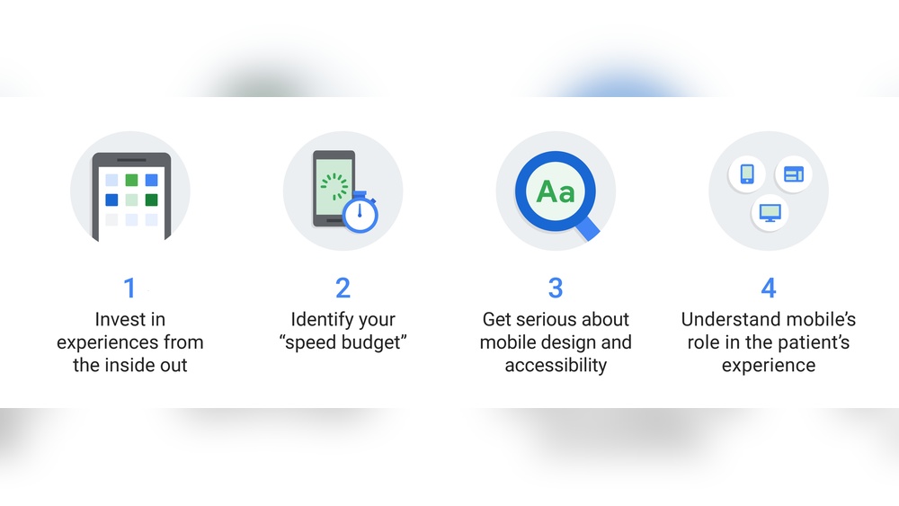
Mobile-first design means creating websites starting with mobile devices. It focuses on small screens first. This approach helps deliver fast, easy-to-use sites on phones and tablets. Mobile users get a better experience. Desktop versions build on the mobile design.
Mobile-first design improves site speed and usability. It reduces unnecessary content and focuses on what matters most. This method also helps with SEO since Google favors mobile-friendly sites.
Responsive layouts adjust to different screen sizes. They ensure your site looks good on phones, tablets, and desktops. Use flexible grids and images. This avoids horizontal scrolling and zooming. Responsive design saves time by using one code base for all devices.
Show the most important content first. Mobile users want quick answers. Place key information at the top. Hide or remove less important elements. This reduces load times and clutter. Prioritizing visible content keeps users engaged.
Use simple menus easy to tap on small screens. Hamburger menus are popular for mobile. They save space and keep navigation clean. Make menu items large with enough spacing. This prevents tapping errors and improves user experience.
Choose clear fonts that are easy to read on small screens. Use larger font sizes for better visibility. Buttons must be big enough for fingers. Avoid tiny links that are hard to tap. Clear fonts and buttons improve usability and reduce bounce rates.
The viewport meta tag controls how your site scales on mobile devices. It sets the width to the device’s width. This ensures content fits the screen without zooming. Adding this tag is essential for mobile-friendly design and faster page load.
Improving user experience on mobile devices boosts engagement and satisfaction. Small design changes can make a big difference. Focus on features that make browsing easy and intuitive. Fast, smooth interactions keep visitors on your site longer. Clear calls to action guide users toward your goals. Removing annoyances like intrusive pop-ups creates a pleasant environment. Proper text layout improves readability on small screens.
Click-to-call buttons let users call you instantly. This feature is helpful for mobile users who want quick contact. Place these buttons where they are easy to find. Use large, tappable buttons with clear labels. This saves time and improves user convenience.
Pop-ups that block content frustrate users and slow down the site. Limit their use or remove them entirely on mobile. Use gentle, easy-to-close pop-ups if needed. This avoids interrupting the user’s flow and improves overall experience.
Long blocks of text overwhelm mobile readers. Use short paragraphs and bullet points for easier scanning. Add headings to organize content clearly. Leave space between lines and paragraphs. This helps users absorb information without effort.
Make calls to action clear and easy to tap on small screens. Use bold colors and simple text for buttons. Place CTAs where users naturally look and scroll. Avoid clutter around buttons to reduce misclicks. This guides users to take desired actions quickly.
Users expect quick responses after tapping links or buttons. Provide visual or haptic feedback immediately. This confirms their action worked and reduces confusion. Fast feedback creates a smooth and responsive feel on mobile.
Credit: blog.sagipl.com
Testing and monitoring are essential to ensure your website runs fast and performs well on mobile devices. Regular checks help find problems before visitors notice them. Use different tools and methods to keep your site in top shape. This process supports better user experience and higher search rankings.
Check your website on various smartphones and tablets. Different devices show pages differently. Testing on multiple screens reveals layout or speed issues. Use real devices or device simulators for best results. This ensures all users get a smooth experience.
Google Lighthouse is a free tool for website audits. It measures performance, accessibility, and SEO. Run it in Chrome DevTools or online. Lighthouse gives clear reports and improvement tips. Follow its advice to boost speed and usability.
Google’s Mobile-Friendly Test shows if your site works well on phones. It highlights problems like small text or touch errors. Fix these to improve navigation and readability. Mobile-friendly sites rank better in search results.
Collect data from actual visitors using tools like Google Analytics. Track loading times and user interactions on mobile devices. Real user metrics show how your site performs in real conditions. Use this data to spot slow pages and fix them quickly.
Look at test results and user data to find bottlenecks. Common issues include large images, slow scripts, or too many requests. Optimize images, minify code, and use caching to speed up loading. Repeat tests after fixes to confirm improvements.
Using the right tools and plugins can greatly improve your website speed and mobile experience. These tools help reduce load times, optimize images, and enhance overall performance. Many plugins work automatically, making it easier to keep your site fast without manual effort.
Choosing suitable tools depends on your site’s platform and needs. Combining multiple tools can yield the best results. Below are essential types of tools and plugins to consider for boosting speed and mobile usability.
Images often slow down websites. Compressing them reduces file size without losing quality. Plugins like Smush and TinyPNG help shrink images automatically. Smaller images load faster, improving user experience on mobile devices.
Caching stores copies of your pages to speed up loading. Popular caching plugins like WP Super Cache and W3 Total Cache make pages load instantly on repeat visits. This reduces server load and improves performance, especially on mobile networks.
Monitoring tools track your website’s speed and performance over time. Tools like Google PageSpeed Insights and GTmetrix show what slows your site. They provide simple tips to fix issues and keep your website running smoothly.
Mobile optimization plugins improve the site’s layout and usability on small screens. Plugins such as WPtouch create mobile-friendly versions of your site. They ensure buttons, fonts, and menus work well on smartphones and tablets.
Minification reduces the size of HTML, CSS, and JavaScript files by removing spaces and comments. Plugins like Autoptimize help compress code automatically. This leads to faster page loading and better mobile performance.

Credit: www.amazon.com

Credit: fastercapital.com
Improve mobile website speed by compressing images, minimizing code, leveraging browser caching, prioritizing visible content, and avoiding redirects. Use responsive design and test across devices for optimal performance and user experience.
Optimize your website for mobile by using responsive design and compressing images and code. Simplify navigation with touch-friendly buttons. Ensure readable fonts and clear calls-to-action. Prioritize essential content and avoid intrusive pop-ups. Test your site across multiple devices for smooth mobile user experience.
A common technique to improve website loading speed is compressing images and code. This reduces file sizes and speeds up loading.
Optimize website speed by compressing images and files, minimizing code, enabling caching, reducing redirects, and prioritizing visible content. Use fast hosting and test performance regularly for best results.
Improving website speed and mobile experience boosts user satisfaction. Fast-loading pages keep visitors engaged and reduce bounce rates. Use responsive design to fit all screen sizes perfectly. Compress images and minimize code for quicker load times. Simplify navigation with clear menus and large buttons.
Test your site on various devices to ensure smooth use. Small changes make a big difference in performance. Focus on these steps to create a better website for everyone. Consistent effort leads to lasting improvements and happier users.


Leave A Reply Now