


Your website is more than just a digital space—it’s your brand’s first impression and your strongest sales tool. If your visitors struggle to find what they need or feel confused by the design, they’ll leave without taking action.
But when your website is built with clear, user-friendly design, it guides people naturally toward what you want them to do. Imagine turning casual visitors into loyal customers, just by improving how your site looks and feels. Ready to discover how smart website building combined with great user experience design can boost your conversions?
Keep reading, because the right design changes can make all the difference for your success.

Credit: capturly.com
Building a website that sells is about more than just looks. The right design makes shopping easy and enjoyable. For e-commerce, choosing the best website builder shapes user experience and sales. The 2025 market offers many options, each with unique tools and features. This guide compares the top e-commerce website builders, helping you find a platform that fits your business needs.
Shopify stands out for its simplicity and power. It offers many templates designed for sales. The platform supports multiple payment options and has built-in marketing tools.
Shopify works well for businesses of all sizes, from startups to large stores.
Wix combines creative freedom with solid e-commerce tools. It has a simple editor and many customizable templates. Wix supports multiple payment gateways and automatic tax calculations.
Ideal for small to medium stores seeking unique design options.
BigCommerce offers deep e-commerce features and scalability. It supports multiple sales channels and advanced analytics. BigCommerce also handles complex product options and shipping rules.
Best for businesses planning to grow quickly and manage large catalogs.
Squarespace is known for its stunning templates and user-friendly platform. It offers integrated e-commerce tools and supports inventory management. Payment options include Stripe and PayPal.
Great choice for creative sellers and small businesses.
| Platform | Ease of Use | Design Flexibility | Payment Options | Best For | Transaction Fees |
|---|---|---|---|---|---|
| Shopify | Very Easy | Moderate | Multiple | All Sizes | Yes (unless using Shopify Payments) |
| Wix eCommerce | Easy | High | Multiple | Small to Medium | No |
| BigCommerce | Moderate | Moderate | Multiple | Growing Businesses | No |
| Squarespace Commerce | Easy | High | Stripe, PayPal | Creative Small Shops | No |
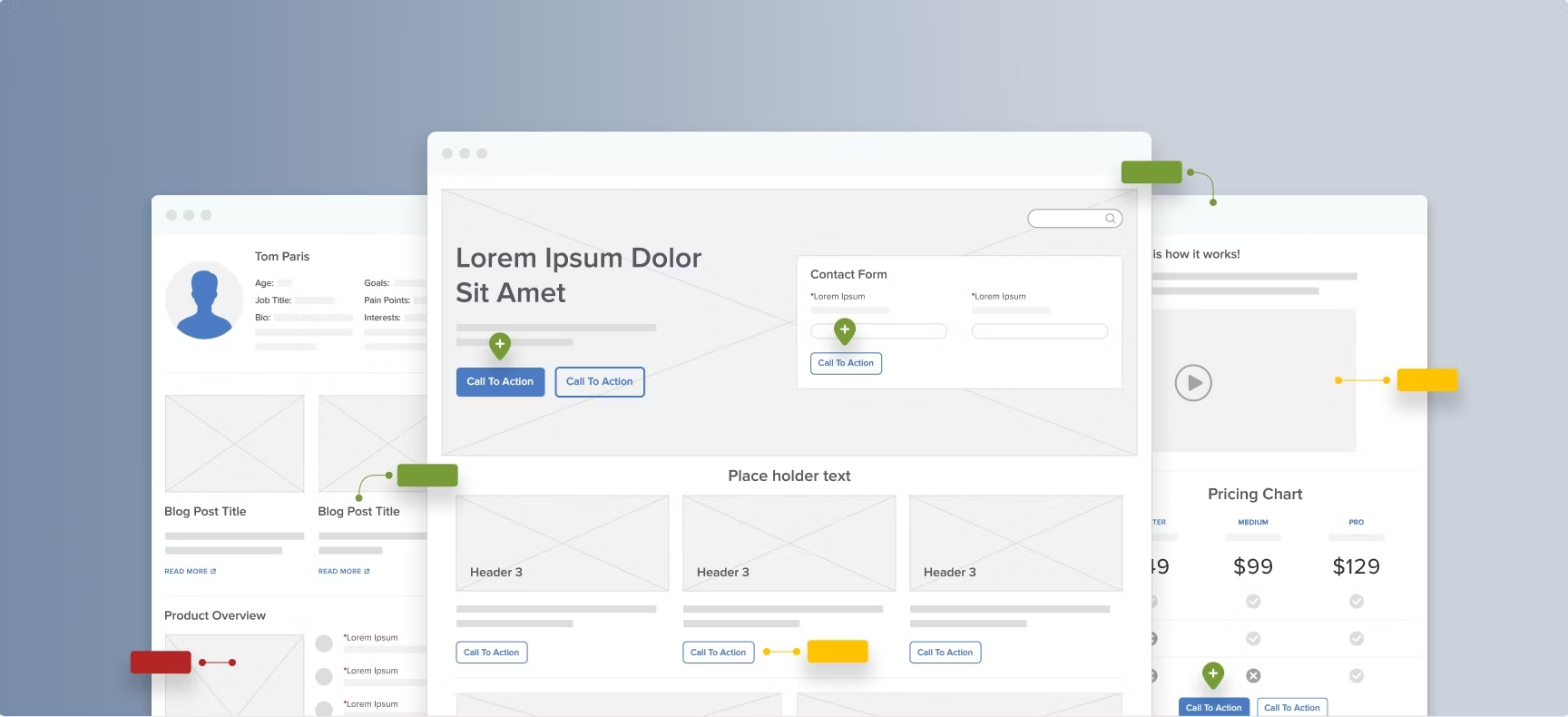
Homepage Structure That Increases Trust & Sales is key to a successful website. The homepage is the first thing visitors see. It must clearly show who you are, what you offer, and why visitors should stay. A well-structured homepage builds trust fast. It guides visitors to take action, like buying or contacting you. Good design and clear layout help visitors feel confident and ready to engage.
Strong branding on the homepage makes your business memorable. Place the logo at the top left corner. Use a tagline that explains your value in simple words. Brand colors and fonts should be consistent throughout the page. This creates a professional look and builds trust.
Navigation should be easy and clear. Use a horizontal menu with 4-6 main links. Avoid clutter. Visitors must find important pages like Products, About, and Contact quickly. Consider a sticky menu that stays visible while scrolling. This helps users browse without confusion.
The headline is the first text visitors read. It must grab attention and explain your main offer. Follow it with a subheadline that adds detail and builds interest. Use bold text and keep sentences short. For example:
Get Fresh, Organic Produce Delivered Fast
Healthy food from local farms, right to your door.
Trust signals reduce doubts and increase sales. Include:
Place these near the call to action (CTA) for best effect.
CTAs guide visitors to take the next step. Use buttons with action words like “Shop Now,” “Get Started,” or “Contact Us.” Make buttons large and in a contrasting color. Position CTAs above the fold and repeat them as users scroll.
Speed matters. Slow pages lose visitors and sales. Optimize images and reduce code to load quickly. Use a responsive design that works well on phones and tablets. Mobile users must have the same easy experience as desktop visitors.
Product pages are the heart of any online store. They decide if a visitor buys or leaves. A well-designed product page turns curious browsers into happy buyers. It combines clear images, useful information, and easy navigation. This boosts sales and keeps customers coming back.
Clear and High-Quality Images
Images show the product to customers. Use bright, sharp photos from different angles. Include zoom features so buyers can see details.
Good images build trust and help buyers imagine owning the product.
Simple and Persuasive Product Descriptions
Write descriptions that explain the product clearly. Use short sentences and bullet points. Focus on benefits, not just features.
Descriptions should answer common questions and remove doubts.
Easy-to-Find Call to Action (CTA)
The CTA button is critical. It should stand out and be easy to spot. Use action words like “Buy Now” or “Add to Cart”.
Place the button near product details and images. Make sure it works on all devices.
Fast Loading and Mobile-Friendly Design
Slow pages lose buyers. Optimize images and code for quick loading. Ensure the page looks good on phones and tablets.
Mobile-friendly design increases sales as many shoppers use mobile devices.
Customer Reviews and Ratings
Reviews build trust. Show star ratings and honest customer feedback. Highlight top reviews near the CTA.
Good reviews make buyers feel safe and confident.
Checkout Optimization plays a key role in reducing cart abandonment on websites. A smooth checkout process keeps customers from leaving before they finish buying. Many shoppers leave carts because the process is too long or confusing. Improving checkout steps helps increase sales and user satisfaction. Simple, clear, and fast checkout designs encourage users to complete their orders.
Make the checkout quick and easy by reducing the number of steps. Ask only for essential information. Use a progress indicator to show users where they are in the process. Avoid asking for unnecessary details that slow users down.
Show customers their data is safe. Use security badges and SSL certificates prominently. Display payment method icons clearly. Explain privacy policies in simple words to reduce fear and hesitation.
Different customers prefer different payment methods. Provide popular options like credit cards, PayPal, and digital wallets. This variety reduces friction and fits various user preferences.
| Payment Method | Why It Helps |
|---|---|
| Credit/Debit Cards | Widely accepted, easy to use |
| PayPal | Fast, trusted by many users |
| Digital Wallets (Apple Pay, Google Pay) | Quick, secure, mobile-friendly |
| Buy Now, Pay Later | Flexible payment, attracts more buyers |
Use bold, easy-to-see buttons for actions like “Continue,” “Pay Now,” or “Place Order.” Make buttons large enough for all devices. Use simple text that tells users what to do next.
Remove unnecessary links, ads, and pop-ups from the checkout pages. Keep the design clean and focused. This helps users concentrate on completing their purchase without interruptions.
Mobile devices now lead online shopping. Mobile optimization for e-commerce means making sites easy and fast on phones and tablets. A smooth mobile experience helps keep visitors and turns them into buyers. Design that works well on small screens boosts sales and user trust.
Responsive design adjusts the layout to fit any screen size. This means text, images, and buttons look good on phones, tablets, and desktops. A responsive site avoids zooming and horizontal scrolling. It improves user comfort and lowers bounce rates.
Mobile users expect quick access. Slow pages cause people to leave. Optimizing images and reducing code size helps pages load faster. Use tools like lazy loading for images to save bandwidth. Hosting on fast servers also matters.
| Speed Factor | Mobile Impact | Optimization Tip |
|---|---|---|
| Image Size | Slows page load | Compress images |
| JavaScript | Delays content display | Minify scripts |
| Server Response | Long waits | Choose reliable hosting |
Mobile shoppers need easy menus and buttons. Complex menus confuse and frustrate users. Use hamburger menus or bottom navigation bars. Make buttons large enough to tap without error. Clear labels help visitors find products fast.
Building a fast-loading e-commerce site is key for great user experience and better sales. Slow websites cause visitors to leave quickly. Speed matters because customers want quick access to products and easy checkout. Fast sites also rank higher in search engines, bringing more traffic. Below are practical tips to help you optimize your e-commerce site’s speed and keep customers happy.
Choose a hosting provider that offers fast servers and high uptime. Shared hosting can slow your site during traffic spikes. Consider VPS or dedicated hosting for better performance.
Large images slow down page loading. Compress images without losing quality using tools like TinyPNG or ImageOptim.
Excess CSS and JavaScript increase page size and delay loading. Minify these files to remove spaces and comments.
Browser caching saves website data on the user’s device. It speeds up repeat visits by loading stored files instead of downloading again.
| Cache-Control Header | Purpose |
|---|---|
| max-age | Sets how long files stay cached (e.g., 31536000 seconds = 1 year) |
| public | Allows files to be cached by any cache, including browsers and CDNs |
Each redirect and HTTP request adds loading time. Limit redirects and combine files to reduce requests.
Website building and user experience play a huge role in creating designs that convert visitors into customers. Understanding real examples of high-converting stores helps identify what works well. These examples reveal clear layouts, fast navigation, and strong calls to action. Studying these stores shows how design choices affect sales and user satisfaction.
Clear and Simple Navigation
High-converting stores keep navigation easy and straightforward. Users find what they want quickly without confusion. Menus are short with clear labels. Search bars are visible and work well.
This simplicity boosts user confidence and reduces bounce rates.
Strong Visual Hierarchy and Product Focus
Successful stores use size, color, and spacing to guide attention. Important elements like product images and “Add to Cart” buttons stand out. Less important items stay in the background.
These choices help users understand where to click next and improve conversions.
Fast Loading Speed and Mobile Optimization
Speed matters. Slow stores lose visitors fast. High-converting stores load quickly on all devices, especially phones.
| Feature | Benefit |
|---|---|
| Optimized images | Faster page loads |
| Responsive design | Better mobile experience |
| Simple code | Less loading delay |
Fast, smooth experiences keep users engaged and ready to buy.
Clear Calls to Action (CTAs)
CTAs tell users what to do next. High-converting stores use strong, visible CTAs that stand out on the page.
Good CTAs guide users through the buying process smoothly.

Credit: www.digitalsilk.com
Creating a website that visitors find easy to use is key to success. Product filters, categories, and navigation help users find what they want quickly. These elements improve user experience (UX) and can increase sales. Clear categories and smart filters guide visitors smoothly through your site. Good navigation keeps users engaged and reduces frustration. This part of website design focuses on helping people explore products without confusion.
Product filters let users narrow down choices based on their needs. Filters could include size, color, price, or brand. They save time by showing only relevant items. This helps users make decisions faster and feel satisfied. Without filters, visitors may feel lost in a sea of products.
Categories group similar products together. They create a logical structure that users understand. Clear categories make navigation simple and intuitive. Visitors do not have to guess where to find items.
| Category Feature | Benefit |
|---|---|
| Simple labels | Easy to read and understand |
| Logical hierarchy | Helps users drill down to specific products |
| Consistent structure | Keeps navigation predictable |
Navigation guides visitors through your website. It should be easy to find and use on all devices. Good navigation helps users explore without confusion or frustration.
Creating a website that sells well means more than just good looks. It needs to be easy to use and fast. The right plugins and tools help make your online store simple and smooth for visitors. These tools improve how people shop, find products, and check out. They also help you manage your store better. Choosing the best plugins can increase sales and keep customers happy.
Product Search and Filter Plugins
Customers want to find products quickly. Search and filter plugins make this easy. These tools let users type keywords or select categories to narrow down choices. Fast search saves time and reduces frustration.
Cart and Checkout Enhancements
The checkout process should be smooth and simple. Plugins that improve carts and checkout pages increase chances of completed sales. Clear steps and fewer clicks help reduce cart abandonment.
Performance Optimization Tools
Speed matters. Slow stores lose visitors fast. Performance plugins make websites load quicker and run smoother. They reduce waiting time and improve user experience.
| Plugin Type | Function | Benefit |
|---|---|---|
| Cache Plugins | Stores pages temporarily | Faster page loading |
| Image Compression | Reduces image file size | Less bandwidth use |
| Lazy Loading | Loads images as needed | Improves initial load speed |
Customer Support and Feedback Tools
Good support builds trust. Plugins for live chat, contact forms, and reviews keep customers engaged. Feedback tools help improve products and services.
Credit: baymard.com
User experience (UX) in website building focuses on creating easy, enjoyable, and efficient interactions. It ensures visitors find what they need quickly. Good UX boosts engagement and conversions by making navigation intuitive and content clear. It’s key for retaining users and increasing sales.
Design improves conversions by guiding users to take desired actions. Clear calls-to-action, attractive visuals, and simple layouts reduce friction. A well-designed site builds trust and keeps visitors focused on goals. This leads to higher signup, purchase, or inquiry rates.
Responsive design adapts a website’s layout to all device screens. This ensures a smooth experience on phones, tablets, and desktops. It prevents frustration caused by zooming or scrolling. Responsive sites rank better in search engines and improve overall user satisfaction.
Key elements include fast loading times, clear navigation, and compelling content. Interactive features like videos, forms, and chat support also help. Visual hierarchy and consistent design keep users interested. Engaged users spend more time and are likelier to convert.
A well-designed website keeps visitors happy and interested. Clear layouts help users find what they need fast. Good design builds trust and makes people stay longer. Easy navigation guides users smoothly through your pages. Fast loading times stop visitors from leaving too soon.
A website that feels simple and useful turns visits into actions. Focus on design that helps users and meets their needs. This way, your site will attract and keep more customers. Great user experience leads to better results and growth.


Leave A Reply Now