


Are your lead forms costing you potential customers? If your forms are too long, confusing, or cluttered, people will leave without filling them out.
But what if you could design simple, clear forms that almost invite your visitors to complete them? When your forms are easy to understand and quick to finish, your chances of capturing valuable leads skyrocket. You’ll learn how to create lead forms that get filled every time—without overwhelming your audience.
Ready to turn your forms into powerful tools that boost your business? Let’s dive in.
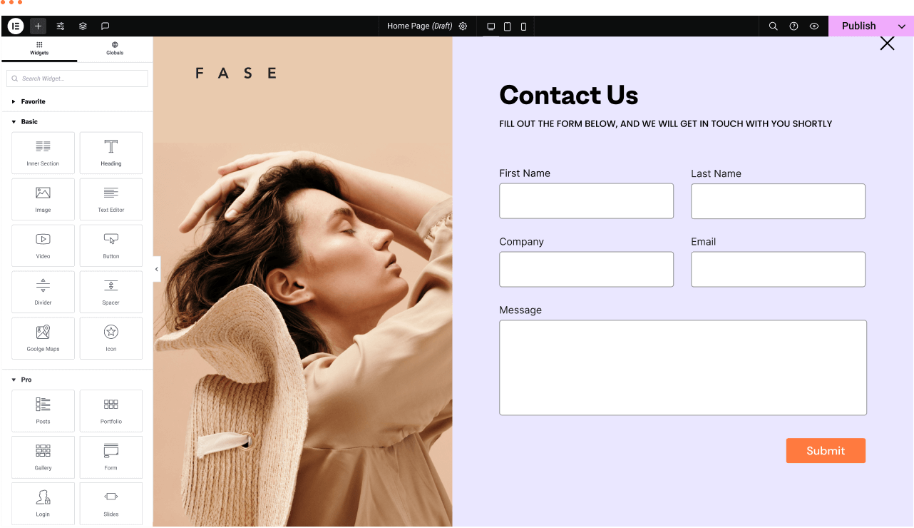
Credit: help.typeform.com
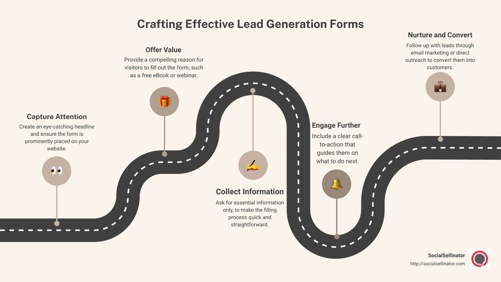
Understanding the basics of lead forms is essential for creating simple, effective forms. A well-designed form encourages visitors to share their information quickly. The goal is to reduce barriers and make the process smooth. Clear, focused forms attract more submissions.
Keeping forms straightforward helps users feel confident and ready to fill them out. Avoid overcomplicating with too many fields or confusing language. Every element should serve a clear purpose. Let’s explore the core aspects that make lead forms work well.
Lead forms come in various types for different needs. Contact forms allow visitors to ask questions or request information. Registration forms collect details for events or accounts. Newsletter signup forms gather emails for updates and promotions. Choose the form type that fits your goal best. Simple forms often get higher completion rates.
Effective forms include essential elements only. A clear headline tells users what the form is for. Labels identify each field clearly and simply. Input fields should ask only for necessary information. Use dropdowns or checkboxes to simplify choices. A strong call-to-action button guides users on what to do next. Avoid clutter to keep the form inviting.
Many users access forms on mobile devices. Forms must be easy to read and fill on small screens. Use large, tappable buttons and fields. Avoid tiny text or crowded layouts. Responsive design adjusts form size automatically. Test forms on different devices to ensure usability. Mobile-friendly forms increase the chance of completion.
Simplicity in design plays a crucial role in encouraging users to complete lead forms. A clean and straightforward form reduces confusion and speeds up the filling process. It helps users focus on what matters most without distractions. Simple forms also work better on mobile devices, improving user experience across screens.
Keep the number of form fields to a minimum. Ask only for essential information like name and email. Long forms can overwhelm users and cause drop-offs. Each extra field adds friction and reduces the chances of completion. Stick to what you really need to follow up with leads.
Use simple language for labels and instructions. Avoid jargon or complex words. Clear text guides users smoothly through the form. Short phrases and direct calls to action work best. Users should understand what to do at a glance, without second guessing.
Give each field enough space to breathe. Whitespace around form elements improves readability. A clean layout prevents clutter and makes the form inviting. Align fields vertically and keep consistent margins. This approach reduces cognitive load and helps users move through the form faster.
Boosting form completion is key to gathering more leads and growing your audience. Simple, clear forms encourage users to finish filling them out. Removing obstacles and making the process smooth helps keep users engaged. Small changes can greatly improve the number of completed forms.
Keep the form short and ask only for essential information. Each extra field can lower completion rates. Use clear labels and place fields logically. Avoid confusing questions or technical jargon. Make sure the form loads quickly and works well on all devices. Provide visible progress indicators for longer forms. These steps reduce frustration and keep users moving forward.
Call-to-action buttons should be clear and direct. Use action words like “Get Started” or “Join Now.” The button color must stand out from the rest of the form. Position CTAs where users can easily see them. Adding a small benefit statement near the button can boost motivation. A strong, focused CTA guides users to complete the form.
Show privacy assurances near the form. A simple note about data protection eases user concerns. Include testimonials or security badges if possible. Avoid asking for sensitive information upfront. Use friendly language that feels welcoming. Trust helps users feel safe sharing their details, increasing form completion.
Placement and timing are key to getting more people to fill out your lead forms. A form shown at the right spot and moment can boost engagement. This section covers how to place forms wisely and choose the best timing. It also explains how to use ads and bots for better results.
Place your forms where visitors spend most time. Above the fold is a smart spot, so users see the form without scrolling. You can also add forms at the end of blog posts or product pages. Make sure the form does not block content or annoy visitors. Use clear and visible buttons to draw attention to the form.
Show your lead forms at moments when users are ready to act. Trigger forms after a visitor spends some time on the page. You can also use exit-intent popups when users try to leave. Avoid showing forms too early; users might not be interested yet. Timing improves the chance users will fill out your form.
Connect your lead forms with ads for fast lead capture. Use instant forms on social media ads for easy signups. Chatbots can also collect lead info during conversations. Bots guide users and ask for details naturally. This integration helps gather leads without interrupting user experience.
Testing and optimization play a vital role in creating lead forms that users complete. Without testing, it is impossible to know which form design works best. Optimization helps improve the form’s performance over time. Small changes can lead to higher conversion rates and better user experience.
A/B testing compares two versions of a form to see which one performs better. Change one element at a time, such as the button color or the number of fields. Show version A to half of the visitors and version B to the other half. Track which form gets more submissions. Use this data to choose the best design.
Watch how users interact with your form. Tools like heatmaps show where users click and scroll. Session recordings reveal where they hesitate or leave the form. Look for patterns that signal confusion or frustration. This insight helps identify problems and areas for improvement.
Collect feedback from users about their experience with the form. Use surveys or direct questions to learn what users like or dislike. Fix issues that users point out and test new ideas. Repeat this cycle regularly to keep your form simple and effective.
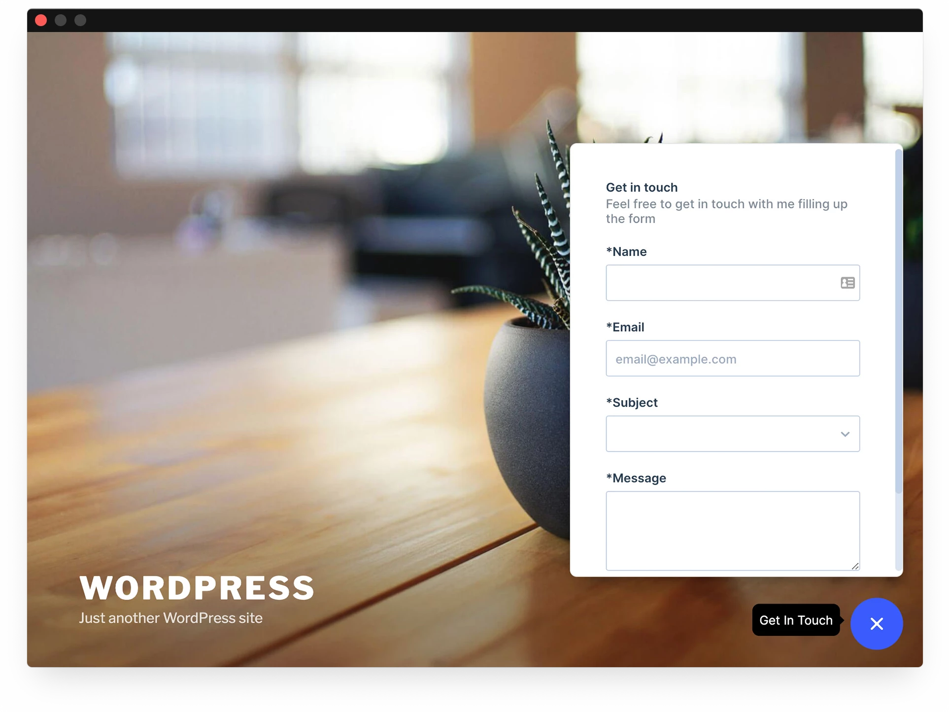
Credit: elementor.com
Real-world examples of lead forms reveal what works best in practice. They show how simple design choices boost form completion rates. Studying these examples helps you build forms that visitors actually fill out. Below are some proven samples and insights from various industries and Meta instant forms.
Effective lead forms keep fields to a minimum. Only ask for essential information like name and email. Clear labels and large input boxes improve usability. A strong call-to-action (CTA) button stands out in color and text. For example, a form with just three fields and a bright “Get Started” button converts well. Including a privacy note increases trust and form submissions.
Different industries need tailored forms. Real estate forms often include budget and location fields. Healthcare forms may ask for symptoms or preferred appointment dates. E-commerce forms focus on email and product interests. Using relevant questions keeps the form short and precise. This relevance encourages users to complete the form quickly.
Meta instant forms load fast on mobile devices. They auto-fill user information, reducing typing effort. Real examples show that shorter forms with fewer fields perform better. Including a clear privacy policy link builds confidence. Testing different headlines and CTAs within Meta forms helps find what works best. These insights guide advertisers to design forms that convert higher.
Credit: community.pipefy.com
Lead forms are online forms designed to collect user information. They help businesses capture potential customer data and boost conversions effectively.
Keep forms short, ask essential questions only, and use clear labels. Make the design clean and mobile-friendly to encourage completion.
Include only necessary fields like name, email, and phone number. Avoid overwhelming users with too many or irrelevant fields.
A well-designed form reduces friction and confusion. Clear layout, sufficient spacing, and minimal fields increase user trust and form completion rates.
Simple lead forms boost your chances of getting more responses. Keep questions clear and limit the number of fields. Use enough space to make the form easy to read. Place your form where visitors can easily find it. Test your forms often to see what works best.
Small changes can lead to bigger results. Remember, a quick and easy form wins every time.


Leave A Reply Now