


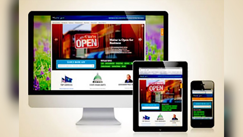
Is your website looking great on every device your visitors use? If not, you could be losing potential customers without even knowing it.
Making your site responsive and mobile-friendly isn’t just a nice-to-have—it’s essential for keeping your audience engaged and satisfied. You’ll discover simple, effective ways to transform your website so it looks perfect and works smoothly on smartphones, tablets, and desktops alike.
Ready to boost your site’s performance and give your visitors the seamless experience they expect? Let’s dive in and make your website truly shine on every screen.
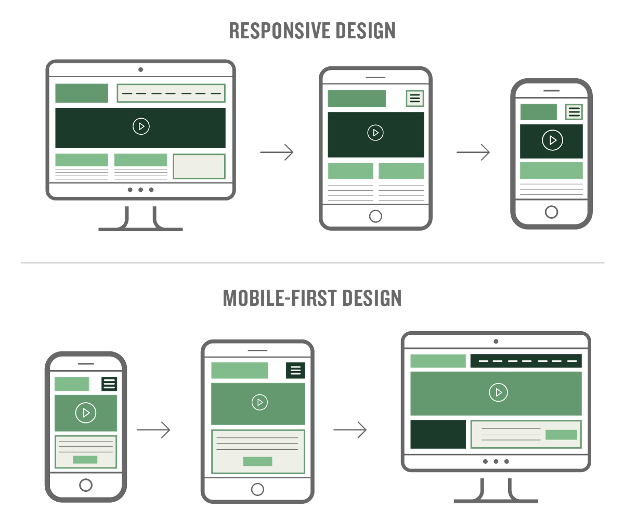
Mobile-first design means starting your website design with mobile users in mind. It focuses on creating a simple, clean, and fast experience for small screens first. Then, the design scales up to larger screens like tablets and desktops. This approach helps ensure your site works well on all devices. It also improves user experience and site performance.
Mobile-first design improves loading speed by reducing unnecessary elements. It makes navigation easier on small screens with larger buttons and clear menus. Google favors mobile-friendly sites in search rankings. This means better visibility for your website. Designing for mobile first also helps you focus on essential content. This keeps your site simple and user-friendly.
Responsive templates adapt to different screen sizes automatically. They use flexible grids and images that resize smoothly. Choosing a responsive template saves time and effort in coding. Most modern templates include built-in mobile-first features. Test templates on various devices to ensure they work well. Pick one that fits your brand style and content needs.
Credit: prerender.io
Fluid grid layouts form the backbone of responsive web design. They allow your site to resize smoothly across different screen sizes. Instead of fixed widths, fluid grids use relative measurements. This approach helps maintain the structure and balance of your site. Visitors get a consistent experience on mobiles, tablets, and desktops alike.
By using fluid grids, you avoid awkward gaps or crowded content. Elements adjust their size based on the screen width. This means your layout flows naturally and looks good everywhere. Fluid grids also improve usability by keeping important content visible and accessible. They are essential for making your site mobile-friendly and responsive.
Fluid grids work by using percentages instead of pixels. Each element’s width changes relative to the container. For example, a column might take up 50% of the screen width. On a large screen, it appears wide. On a small screen, it shrinks proportionally.
This flexibility lets content resize without breaking the layout. Fluid grids also adjust margins and padding to keep spacing consistent. They respond to changes in screen orientation and resolution. This adaptability keeps your site looking neat on any device.
Start by dividing your page into columns using relative units like percentages. Avoid fixed pixel widths to allow growth or shrinkage. Use CSS to define widths for each section based on the total grid.
Test different screen sizes to ensure your layout remains balanced. Adjust column widths and spacing as needed. Use tools like browser developer modes to simulate devices. Proportional layouts keep your content organized and easy to read.
Using fluid grids helps your site perform well on mobiles and desktops. It creates a seamless user experience across all devices. Proportional layouts make managing this easier and more effective.
Media queries allow your website to adapt its layout and style based on the device screen size. They are a core part of responsive design. Media queries check the device’s features like width, height, resolution, and orientation. Then, they apply specific CSS rules to enhance the viewing experience. Using media queries makes your site look good on phones, tablets, laptops, and desktops.
This technique helps you control fonts, images, menus, and other elements for different devices. It ensures your content is readable and easy to navigate without zooming or horizontal scrolling. Media queries improve user experience and boost SEO by making your site mobile-friendly.
With media queries, you can write CSS rules that target specific devices or screen sizes. For example, you might increase font size on small screens for better readability. Or hide complex navigation menus on phones and show simpler ones instead.
You can change colors, spacing, and layout structure depending on the device. This customization keeps your site clean and user-friendly everywhere. Writing media queries is simple and uses the @media rule in CSS. It checks conditions like max-width or min-width to apply styles only when needed.
Breakpoints define the screen widths where your styles change. Some common breakpoints cover most devices:
320px – Small phones480px – Larger phones768px – Tablets1024px – Small laptops1200px – Large desktopsChoose breakpoints based on your site’s design and audience devices. Avoid too many breakpoints to keep your CSS simple. Test on real devices to ensure your layout works well across all screen sizes.
Credit: mbbagency.com
Optimizing images plays a crucial role in making your site responsive and mobile-friendly. Large or unoptimized images slow down page loading times. This affects user experience and search engine rankings. Proper image optimization balances quality and file size. It ensures your site looks great on all devices without delays.
Responsive images adjust to fit different screen sizes. Use the srcset attribute to provide multiple image versions. The browser selects the best image based on device resolution and viewport. This saves bandwidth and improves loading speed on mobile devices.
Implement the picture element for art direction. It allows different images for different screen sizes or orientations. Avoid fixed-width images. Use CSS to make images flexible and scalable within containers.
Compress images to reduce file size without losing quality. Tools like TinyPNG or ImageOptim help shrink images efficiently. Choose the right format: JPEG for photos, PNG for graphics with transparency, and SVG for logos or icons.
Use lazy loading to delay image loading until needed. This reduces initial page load time and saves data on mobile networks. Always test your images on different devices to ensure fast loading and clear display.
Improving site speed is crucial for a responsive and mobile-friendly website. Fast-loading pages keep visitors engaged and reduce bounce rates. Mobile users especially expect quick access to content without delays.
Slow sites frustrate users and harm search engine rankings. Optimizing speed enhances user experience and supports better visibility online. Focus on techniques that reduce load times and remove outdated elements.
Start by compressing images to lower file sizes without losing quality. Use modern formats like WebP for faster downloads. Limit the number of scripts and CSS files to reduce server requests.
Enable browser caching so returning visitors load pages faster. Use content delivery networks (CDNs) to serve content from servers near the user. These steps reduce waiting and improve overall speed.
Flash is outdated and not supported on most mobile devices. It slows down page load and causes compatibility issues. Replace Flash content with HTML5, which is faster and works on all devices.
Use lightweight animations and interactive elements to keep your site engaging without harming speed. Removing heavy elements ensures smoother browsing and a better mobile experience.

Credit: www.hostgator.com
Readable fonts and proper spacing play a vital role in making your website user-friendly on mobile devices. Clear text helps visitors read content without straining their eyes. Adequate spacing avoids accidental clicks and improves navigation.
Fonts that work well on desktops may not look good on small screens. Likewise, tight spacing can make links and buttons hard to tap. Adjusting these elements boosts the overall mobile experience.
Select fonts that remain clear at small sizes. Sans-serif fonts like Arial, Verdana, or Helvetica work best. They have simple shapes that are easy to read on screens.
Keep font sizes at least 16 pixels for body text. Headings should be larger to create a clear hierarchy. Avoid decorative or overly thin fonts that blur on mobile.
Use consistent font styles across your site. Limit yourself to two or three font families. This keeps your design clean and focused.
Space interactive elements so users can tap easily. Links and buttons should have at least 44 pixels of height and width. This matches the average finger size.
Leave enough margin around buttons to prevent accidental taps on nearby elements. Group related links with consistent spacing to guide users.
Use padding inside buttons to make them bigger without changing layout. Proper spacing improves accessibility and reduces user frustration.
The viewport meta tag controls how your website appears on different devices. It tells the browser how to adjust the page’s dimensions and scaling. Without it, your site may look zoomed out or too large on mobile screens. This tag is essential for making your site responsive and mobile-friendly.
To set the viewport correctly, add this tag inside your HTML’s section:
This code sets the page width to match the device’s screen width. The initial scale of 1 means the page loads at normal zoom. It prevents automatic zooming out or zooming in on mobile devices.
You can adjust the values for specific needs, but this is the standard setup for most sites. It works well with responsive CSS layouts and media queries.
The viewport meta tag affects how content fits on mobile screens. Without it, browsers may shrink the page to fit a desktop layout into a small screen. This makes text and buttons too small to read or tap.
With the viewport tag, the layout adapts to the screen size. Text stays readable, and interactive elements remain easy to use. It also helps images and videos scale properly.
Responsive design depends on this tag to deliver a smooth user experience. It ensures your site looks good on phones, tablets, and other devices.
Testing responsiveness ensures your website works well on all devices. It helps catch problems users face on phones or tablets. Testing reveals if text is readable, buttons are easy to tap, and images fit screens. This step is vital for a smooth user experience and better search rankings.
Google Mobile-Friendly Test quickly checks if your site works on mobile devices. Enter your URL on the test page. The tool shows if the page is mobile-friendly or not. It also points out issues like small text or close buttons. Fixing these improves user experience and SEO.
Open your site on different phones and tablets. Check if text is easy to read without zooming. Tap buttons and links to see if they respond well. Test navigation and loading speed. Try both iPhone and Android devices. This real-world check finds problems automated tools miss.
Browser developer tools let you simulate devices on your computer. Open your site in a browser like Chrome or Firefox. Use the device toolbar to switch between screen sizes. Check how your layout adapts to phones and tablets. This method saves time and helps catch design issues early.
Mobile-friendly sites offer smooth user experiences on all devices. They adjust to screen sizes and keep visitors engaged. Understanding key indicators helps create sites that work well on phones and tablets. Focus on layout, text, navigation, and speed to ensure your site meets mobile needs.
A responsive site changes its layout to fit any screen size. Content and images resize without breaking the design. This prevents horizontal scrolling and zooming. Fluid grids and flexible images help maintain a clean look. Media queries allow style changes based on device features. A flexible layout keeps users comfortable and engaged.
Text must be easy to read on small screens. Use clear fonts with enough size and spacing. Avoid long lines by limiting paragraph width. Contrast between text and background improves visibility. Proper text scaling stops users from zooming in. Good readability reduces bounce rates and improves user satisfaction.
Clickable elements like buttons and links need enough space. Small or crowded taps cause frustration. Touch targets should be at least 44×44 pixels. Menu items must be easy to find and use. Clear navigation guides users through the site. Simple, well-spaced taps improve mobile usability.
Mobile users expect quick page loads. Slow sites increase bounce and lower rankings. Optimize images and minimize code to speed up loading. Use caching and content delivery networks (CDNs). Test speed regularly with tools like Google PageSpeed Insights. Fast sites keep visitors happy and boost SEO.
Use a mobile-responsive design and optimize images for fast loading. Choose readable fonts and space out clickable elements. Implement the viewport meta tag and test usability on various devices. Avoid Flash and ensure navigation is easy on small screens.
Use a fluid grid layout to adapt to all screen sizes. Apply CSS media queries for device-specific styling. Optimize images, fonts, and spacing. Implement the viewport meta tag. Test responsiveness on multiple devices for a seamless user experience.
Use Google’s Mobile-Friendly Test for quick analysis. Check readability, navigation, and load speed on multiple devices. Ensure responsive design and easy tap targets for a better mobile experience.
Use a fluid grid layout and CSS media queries to adapt your site to different screen sizes. Optimize images, improve loading speed, and implement the viewport meta tag. Choose mobile-friendly fonts and space out clickable elements for better usability on all devices.
Making your site responsive and mobile-friendly improves user experience greatly. It helps visitors navigate easily on any device. Simple steps like using fluid grids and media queries make a big difference. Testing on phones and using tools ensures your site works well everywhere.
Keep fonts clear, images optimized, and buttons spaced for easy tapping. A responsive site keeps users engaged and coming back. Start with these basics to build a site that fits all screens perfectly. Your visitors will thank you with longer visits and better interactions.


Leave A Reply Now