


When visitors land on your corporate website, their eyes need a clear path to follow. You want them to instantly see what matters most—whether it’s your services, key messages, or calls to action.
That’s where typography and visual hierarchy come into play. By carefully choosing fonts, sizes, colors, and layout, you guide your audience’s attention and make your site not just attractive, but effective. If you want your corporate site to stand out, keep visitors engaged, and boost conversions, understanding how to master typography and visual hierarchy is essential.
Ready to learn how to structure your content so your audience never misses what’s important? Let’s dive in.
Typography is key for any corporate website. It shapes how visitors read and understand content. Clear typography improves user experience and strengthens brand identity. Simple, well-planned text guides users through information smoothly. This section covers the basics of typography for corporate sites.
Typefaces are the design styles of letters. Fonts are specific styles within a typeface family. Choose typefaces that look professional and are easy to read. Sans-serif fonts work well for digital screens. Limit the number of typefaces to two or three. This keeps the design clean and consistent.
Font size controls how big or small the text appears. Use larger sizes for headings and smaller for body text. Font weight means how bold or light the text looks. Bold weights highlight important points. Use different sizes and weights to create a clear reading order. This helps users scan the page quickly.
Color affects readability and mood. Use high contrast between text and background. Dark text on a light background is easiest to read. Avoid too many colors; stick to brand colors. Italics and underlines can emphasize text but use them sparingly. Consistent style choices build trust and make the site look polished.

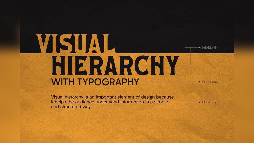
Credit: www.letterhend.com
Visual hierarchy is key to guiding visitors on corporate sites. It helps users notice important information first. Good visual hierarchy makes a website clear and easy to navigate. It uses typography and layout to show what matters most. Applying these principles improves user experience and boosts engagement.
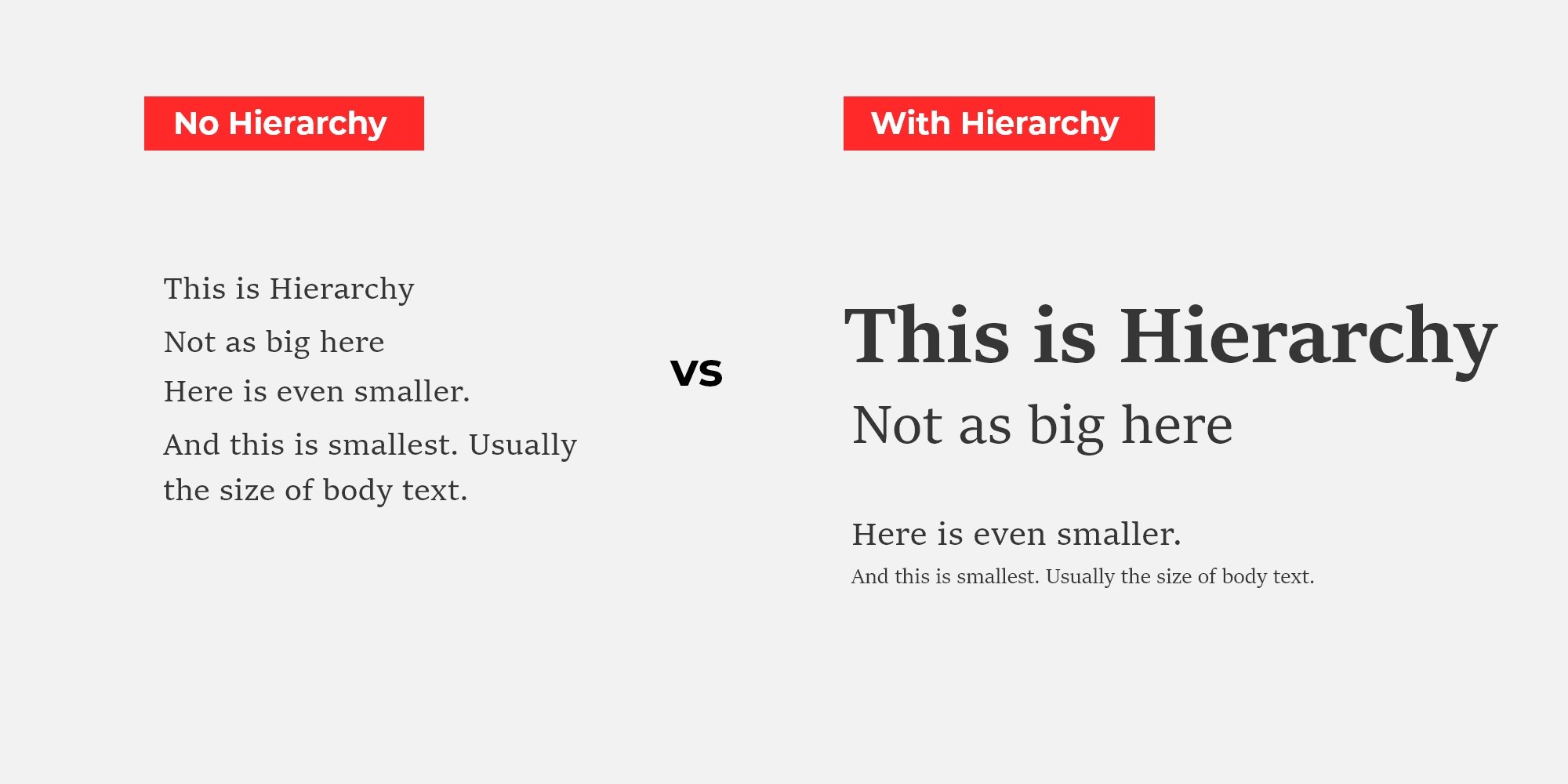
Place the most important elements at the top or center. Use larger fonts for key headings to catch attention. Subheadings and body text should be smaller but readable. Group related content close together to show connection. This order helps users scan the page quickly.
Contrast makes elements stand out from each other. Use bold fonts, color differences, or size changes to create contrast. White space around text and images gives the design room to breathe. Proper spacing prevents clutter and improves readability. Clear contrast and spacing guide the eye smoothly.
Align text and images along a grid for a neat layout. Grids create balance and harmony in the design. They ensure consistent spacing between elements. This makes the site look organized and professional. Grid alignment helps users follow the flow of content easily.
Applying hierarchy in corporate sites helps users find important information quickly. It guides visitors through content in a clear, logical order. Proper hierarchy makes the site easier to scan and improves user experience. Typography plays a key role in creating this hierarchy by organizing text visually.
Highlight the most important messages using larger, bolder fonts. Use headings and subheadings to separate sections clearly. Key content should stand out immediately on the page. This approach helps visitors focus on what matters first without confusion.
Combine typography with images and icons to support the message. Avoid overcrowding pages with too much text or too many visuals. Proper spacing between elements prevents clutter and improves readability. Balance keeps users engaged and guides their eyes naturally.
Use fonts and colors that reflect the corporate brand identity. Consistent typography builds trust and recognition over time. Stick to a limited set of typefaces to keep the design clean and professional. Consistency reinforces the brand’s message across all pages.
Typography plays a vital role in engaging visitors on corporate websites. It shapes how users perceive content and helps keep their focus. Proper typography creates a clear structure and invites users to explore more.
Well-chosen fonts and styles improve the overall experience. They guide readers through the page smoothly. Typography and visual hierarchy work together to build trust and professionalism.
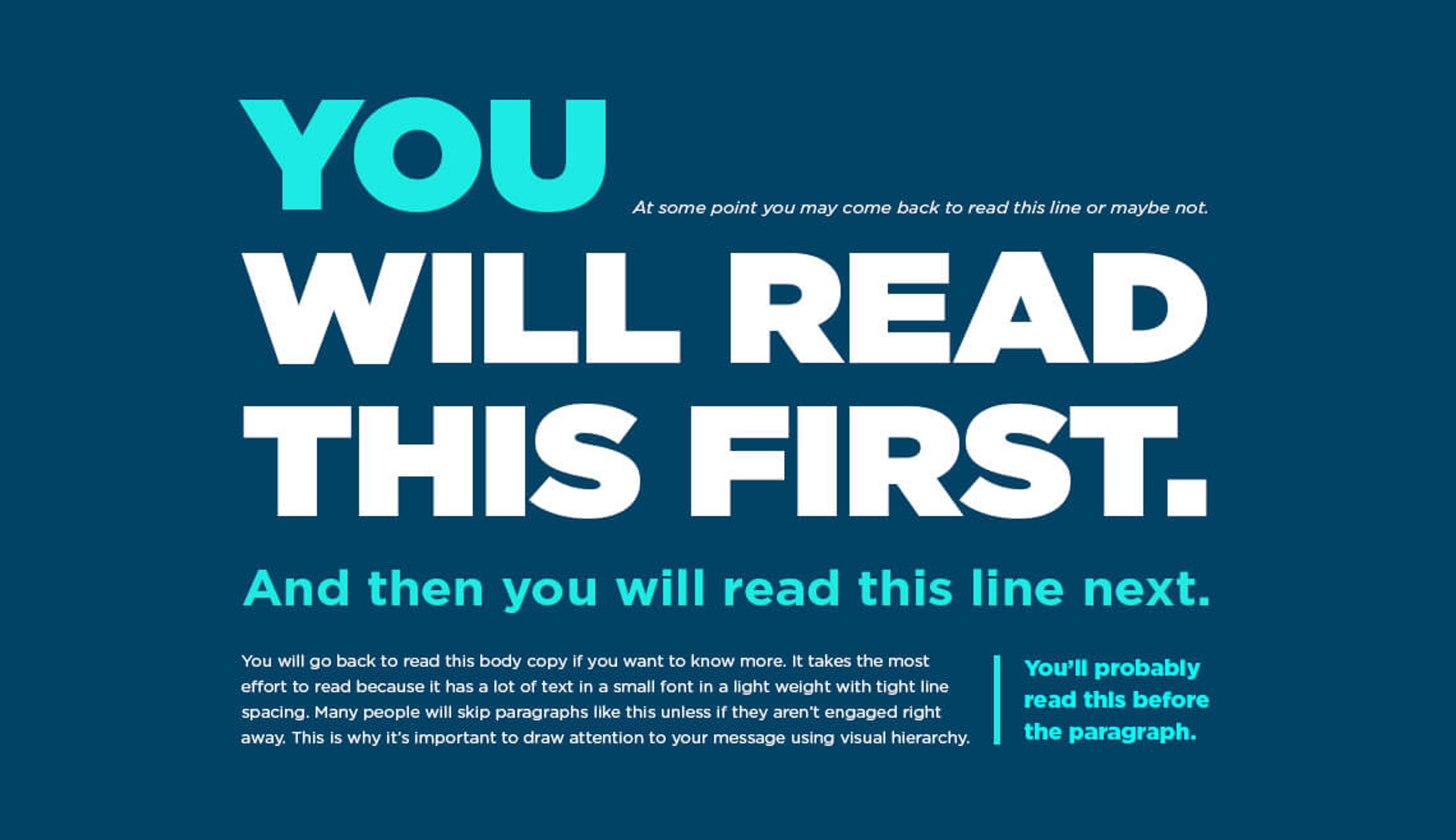
Typography directs where users look first. Larger fonts highlight important headings. Bold or contrasting text draws the eye to key messages. Using different font sizes creates a natural path for reading. This helps users find what matters without effort.
Clear typography makes text easier to read. Simple fonts and proper spacing reduce eye strain. Avoiding overly decorative fonts keeps content clean. Line height and paragraph spacing also affect how quickly users understand information. Readable text encourages visitors to stay longer on the site.
Good typography influences user actions. Clear call-to-action buttons with readable fonts get more clicks. Highlighting benefits with distinct text styles increases interest. When users understand content fast, they are more likely to respond. Effective typography turns visitors into customers.
Typography and visual hierarchy shape how users read and understand content on corporate sites. Mistakes in these areas confuse visitors and reduce site effectiveness. Avoiding common errors helps create clear and appealing designs.
Using too many fonts clutters your website’s appearance. Mixing many styles distracts users and weakens brand identity. Limit fonts to two or three for a clean, consistent look. Choose styles that complement each other. Keep headings and body text simple and readable.
Many users visit sites on phones or tablets. Fonts that look good on desktops may appear too small or large on mobile screens. Text can become hard to read if not adjusted. Test typography on multiple devices. Ensure font sizes and spacing adapt well to smaller screens.
Accessibility makes your site usable for everyone, including people with disabilities. Poor contrast between text and background reduces readability. Avoid fancy fonts that are hard to read. Use clear, legible typefaces and sufficient font sizes. Follow accessibility guidelines to improve user experience.
Credit: clay.global
Effective typography and clear visual hierarchy shape the success of corporate websites. Proper tools and resources help designers create well-structured text that guides visitors smoothly. These tools simplify the process of organizing fonts and sizes, improving readability and user experience.
Using the right resources saves time and boosts design quality. Here are some key tools and recommendations to build strong typography and visual hierarchy on corporate sites.
Typography hierarchy generators create font size and weight scales automatically. They help designers find balanced combinations for headings, subheadings, and body text. These tools ensure consistent spacing and clear importance levels throughout the site. Examples include Modular Scale, Type Scale, and Fontjoy. These generators reduce guesswork and speed up the design process.
Design software offers powerful features for typography and hierarchy control. Adobe XD, Figma, and Sketch provide tools for font management, spacing, and alignment. They support live previews and easy adjustments. These programs help maintain consistency across pages and devices. They also allow collaboration among team members for smoother workflows.
Studying successful corporate websites offers practical ideas for typography and hierarchy. Brands like Apple, IBM, and Microsoft use clear font structures to guide visitors. Their sites show effective use of size, color, and spacing. Analyzing these examples helps designers understand what works well in real-world settings. Inspiration from top companies encourages better design decisions.
Credit: admiral.digital
Visual hierarchy arranges website elements by importance. It guides users’ focus and improves content clarity. Effective visual hierarchy enhances user experience and site navigation on corporate websites.
Typography influences readability and user engagement. Proper font size, style, and weight create clear information order. It helps users quickly find key messages on corporate sites.
Fonts reflect brand personality and professionalism. Consistent font use strengthens brand identity and trust. Choosing appropriate fonts aligns with corporate values and audience expectations.
Use varying font sizes, weights, and styles. Highlight headings and important content first. Maintain consistency and balance to improve content scanning and comprehension.
Effective typography and clear visual hierarchy improve corporate site usability. They guide visitors through content smoothly and highlight key messages. Choosing the right fonts, sizes, and colors creates balance and focus. Simple, consistent design builds trust and professionalism. Prioritize readability to keep users engaged longer.
Well-planned hierarchy helps users find information quickly. These design choices support business goals and enhance user experience. Keep refining your typography and layout for best results. Small changes can make a big difference in clarity and appeal.


Leave A Reply Now