


When you create a custom solution, it’s not enough for it to just work — it needs to be easy and enjoyable for your users. If your users struggle to navigate or understand your solution, they’ll quickly lose interest, no matter how powerful the features are.
So, how do you make sure your custom solution feels natural and simple to use? You’ll discover practical strategies that focus on your users’ needs and habits. By applying these tips, you’ll turn your custom solution into something your users love to use every day.
Ready to make your solution truly user-friendly? Let’s dive in.

Credit: tritonmedicalsolutions.com
User research is the foundation of any user-friendly custom solution. It helps understand who the users are and what they need. This research guides design and development to meet real user expectations.
Without user research, solutions risk being confusing or irrelevant. It ensures the product fits user habits and solves their problems effectively. The process involves identifying the audience, analyzing needs, and creating detailed user personas.
Start by defining who will use the solution. Look at demographics like age, location, and job roles. Consider their experience with similar tools. Knowing the audience helps tailor features and design.
Use surveys, interviews, and data analysis to gather this information. The clearer the target group, the easier it is to make the solution user-friendly.
Understand what problems users face and what they want to achieve. Study their daily tasks and challenges. Identify gaps in current solutions they use.
Focus on user goals, pain points, and preferences. This analysis reveals what features are essential and which can be simplified or removed.
User personas are fictional characters representing key user groups. Each persona includes background, goals, and frustrations. They help keep design decisions user-centered.
Build personas from real research data. Use them to visualize user behavior and test ideas. Personas ensure the solution stays relevant and easy to use for actual users.
Simplicity in design plays a key role in making custom solutions easy to use. It helps users focus on what matters most. A simple design reduces confusion and speeds up task completion. Clear, straightforward layouts make navigation smooth and intuitive. Users feel confident and satisfied when they can use a solution without extra effort.
Focus on the features users need the most. Avoid adding unnecessary options that distract from the main task. Highlight core functions clearly. This helps users find what they want fast. Keeping only essential elements improves usability and reduces errors.
Remove all extra details that do not add value. White space creates a clean look and makes content easier to read. Limit the number of colors, fonts, and buttons on the screen. A clutter-free design lets users focus on important parts without feeling overwhelmed.
Organize content by importance using size, color, and placement. Headings should stand out and guide users through the interface. Buttons and links need to be easy to spot. Visual hierarchy directs attention naturally and helps users complete tasks quickly.
Intuitive navigation is key to making custom solutions easy for users. It helps users find what they need quickly. Good navigation reduces frustration and keeps users engaged. Simple and clear paths guide users through your solution smoothly. This section explains how to design navigation that feels natural and easy to follow.
Use navigation styles that users already know. Common patterns like top menus or sidebars work well. Users do not have to learn new ways to move around. Familiar designs save time and reduce errors. Stick to standard icons and labels to help users recognize options fast.
Organize menus with clear categories and labels. Avoid clutter by limiting the number of menu items. Group related items together so users understand where to find things. Use simple words that describe the content clearly. A clean menu helps users scan and pick choices easily.
Calls to action (CTAs) should stand out and be easy to spot. Use contrasting colors and clear text to draw attention. Action words like “Start,” “Submit,” or “Learn More” tell users what to do. Place CTAs where users expect them, such as at the end of a task or page. Clear CTAs guide users to complete important steps without confusion.
Accessibility features make custom solutions easier for everyone to use. They help people with different abilities interact smoothly with your product. Adding these features increases satisfaction and broadens your user base.
Focus on clear fonts, easy navigation, and compatibility with assistive tools. These steps make your solution inclusive and user-friendly.
Choose fonts that are simple and easy to read. Avoid fancy or thin styles. Use a font size that works well on all devices.
Pick colors with high contrast between text and background. This helps users see content clearly. Avoid color combinations that are hard to distinguish, like red and green.
Make sure users can navigate your solution using only a keyboard. This helps people who cannot use a mouse.
Include visible focus indicators to show where users are on the page. Allow easy tabbing through links, buttons, and form fields.
Ensure your solution works well with screen readers and other assistive tools. Use proper HTML tags and labels for elements.
Provide alternative text for images and clear descriptions for buttons. This helps users understand content through audio or braille devices.
Responsive layouts are key to making custom solutions easy to use. They adapt the design to fit any screen size. This ensures users have a smooth experience on phones, tablets, and desktops. Responsive layouts improve accessibility and keep users engaged.
Design your solution to work on all device types. Smartphones, tablets, laptops, and desktops must all display content correctly. Use media queries to adjust styles based on screen size. This avoids awkward zooming or horizontal scrolling. A well-optimized layout makes navigation simple everywhere.
Use flexible grid systems to arrange content fluidly. Grids help elements resize and reposition smoothly. Images should also be flexible, scaling with the screen size. Use relative units like percentages instead of fixed pixels. This approach maintains balance and clarity on any device.
Check your solution on various browsers and devices. Testing reveals layout issues or broken elements early. Include popular platforms like Chrome, Safari, and Firefox. Also test on different operating systems such as iOS and Android. Regular testing ensures consistent user experience everywhere.
Customization options play a vital role in making custom solutions user-friendly. They let users tailor the product to their needs and preferences. Thoughtful customization improves satisfaction and engagement. It also reduces frustration by adapting to different user styles.
Effective customization should be easy to access and clear to use. Users must feel in control without being overwhelmed. Balancing choice and simplicity is key. Below are important aspects to consider when offering customization options.
Allow users to save their preferences for future use. This saves time and effort in repetitive settings. Preferences can include themes, layouts, or notification types. Make it simple to change or reset preferences anytime. Clear options empower users to personalize their experience.
Dynamic settings adjust based on user behavior or context. They help the solution feel smarter and more responsive. For example, hide advanced options until needed or suggest settings based on past actions. Dynamic controls reduce clutter and guide users naturally. They create a smoother interaction flow.
Offer enough flexibility for diverse needs without confusing users. Too many options can overwhelm and slow down tasks. Group settings logically and use plain language labels. Provide default settings that work well for most users. Allow advanced users to explore deeper customization. This balance keeps the solution friendly for all skill levels.
Performance optimization plays a key role in making custom solutions user-friendly. Slow, laggy systems frustrate users and reduce satisfaction. Optimizing performance ensures smooth, fast, and efficient experiences. This section covers essential tactics to boost performance without overcomplicating the solution.
Fast load times keep users engaged and reduce bounce rates. Always aim to deliver content quickly, even on slower connections. Use caching to store frequently accessed data. Compress files like images and scripts to shrink their size. Test load times regularly to catch delays early.
Clean, efficient code improves speed and makes maintenance easier. Remove unnecessary scripts and redundant functions. Write simple, clear code that performs tasks without extra steps. Use asynchronous loading to prevent blocking the interface. Regularly review and refactor code to maintain quality.
Minimizing resource use reduces strain on devices and servers. Limit the number of external requests and plugins. Optimize images to use less memory and bandwidth. Use lazy loading to load content only when needed. Keep the solution lightweight to improve performance on all devices.
Clear feedback mechanisms guide users through custom solutions effectively. They show users what is happening and what to do next. This reduces confusion and builds trust. Feedback must be simple and visible at all times. Users feel confident when the system talks back clearly.
Feedback helps users recover from mistakes fast. It confirms successful actions too. Without feedback, users may guess or stop using the solution.
Error messages should be easy to read and understand. Use plain language to explain what went wrong. Avoid technical terms that confuse users. Show how to fix the problem step-by-step. Place messages near the error source for quick attention. Use color and icons to highlight errors but do not overwhelm. Timely error messages stop frustration and keep users moving forward.
Success indicators confirm when users complete tasks correctly. Use simple signals like checkmarks or green colors. Text like “Saved” or “Done” reassures users. These signals encourage users to continue without fear. Immediate success feedback motivates users to explore more features. Make sure success indicators are consistent across the solution.
Interactive responses react instantly to user actions. Buttons change color or animate on clicks. Forms show progress bars or loading spinners. These responses tell users their input is received. They prevent repeated clicks or confusion. Small animations and sounds can enhance clarity. Keep interactions smooth and fast to maintain flow.
Testing and iteration are key to making custom solutions user-friendly. This process helps find problems early and improves the product step by step. Each test gives valuable insights on how real users interact with your solution. Iteration then uses this feedback to make changes and enhancements.
Usability testing checks how easy your solution is to use. Invite real users to complete tasks while you observe. Note any issues or confusion they face. This reveals barriers that block smooth user experience. Testing should cover different user types and devices.
Collect feedback directly from users after they try your solution. Use surveys, interviews, or simple feedback forms. Ask clear questions about their experience and difficulties. Listen carefully to their suggestions for improvements. This feedback guides your next steps in design.
Use the data from testing and feedback to improve your solution continuously. Fix usability problems and add helpful features. Repeat testing to see how changes affect the user experience. This cycle keeps your solution aligned with user needs over time.
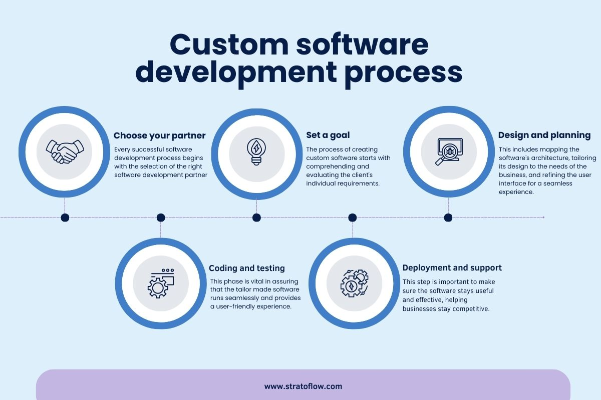
Credit: stratoflow.com
Good documentation and solid support are key to making custom solutions user-friendly. Clear guidance helps users feel confident using your product. Fast, easy help keeps frustration low and satisfaction high.
Focus on making help resources simple to find and understand. Support options should fit different user needs and preferences. This approach improves user experience and encourages continued use.
Place help links where users expect them. Use menus, footers, or tooltips for quick access. A visible search bar for documentation is useful. Make sure users do not waste time hunting for answers.
Write documentation in clear, plain English. Avoid technical jargon or complex terms. Use short sentences and common words. Explain any necessary technical terms simply. This helps non-native speakers and beginners understand easily.
Provide different ways for users to get help. Include email, live chat, and phone support if possible. Use FAQs and forums for common questions. Multiple channels let users pick the best option for their needs.

Credit: nhtrailers.com
We ensure user-friendly designs by conducting user research, simplifying interfaces, using clear visuals, optimizing for all devices, and testing extensively.
Simplify design by prioritizing essential elements and minimizing clutter. Use clear language, intuitive navigation, and responsive layouts. Test across devices and gather user feedback. Ensure fast loading, accessible fonts, and clear calls to action.
Make interfaces user-friendly by keeping design simple and clean. Use clear navigation, readable fonts, and high contrast. Ensure responsiveness on all devices. Provide immediate feedback and prioritize essential features. Conduct user research to understand needs and test frequently for improvements.
We ensure a user-friendly app by researching users, simplifying design, optimizing for devices, using clear fonts, and providing instant feedback.
Creating custom solutions that users find easy and enjoyable matters most. Focus on simple design and clear instructions. Test your solution on different devices often. Listen to user feedback and make changes quickly. Keep language plain and avoid technical words.
A friendly solution helps users work better and saves time. Remember, usability leads to satisfied users and project success.


Leave A Reply Now