


If you want more students to sign up for your course, your landing page needs to do more than just look good—it has to connect, convince, and convert. You’re just one page away from turning visitors into eager learners.
But how do you build a course landing page that grabs attention and drives action? This guide will show you simple, powerful steps to create landing pages that speak directly to your audience’s needs, reduce doubts, and inspire them to enroll.
Keep reading to discover the secrets behind landing pages that don’t just attract clicks but actually boost your course sales.
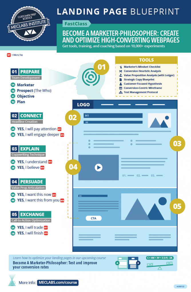
Credit: meclabs.com
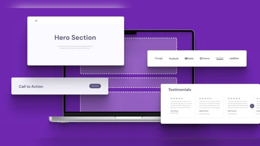
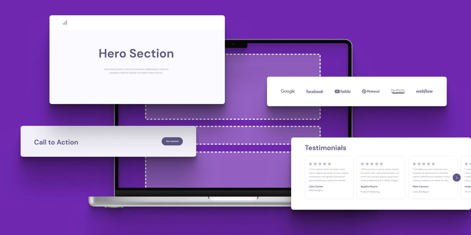
Creating a course landing page that converts starts with including the right elements. These components work together to catch attention and guide visitors toward signing up. Focus on clarity, engagement, and simplicity to keep users interested.
State exactly what your course offers and why it matters. Use simple language to explain the benefits. Visitors should understand what they gain within seconds. Avoid vague or complex descriptions. A clear value proposition builds trust and interest quickly.
Headlines must grab attention and spark curiosity. Use short, direct sentences that highlight key points. Effective headlines make visitors want to read more. Place them prominently at the top of the page. They guide visitors through the content smoothly.
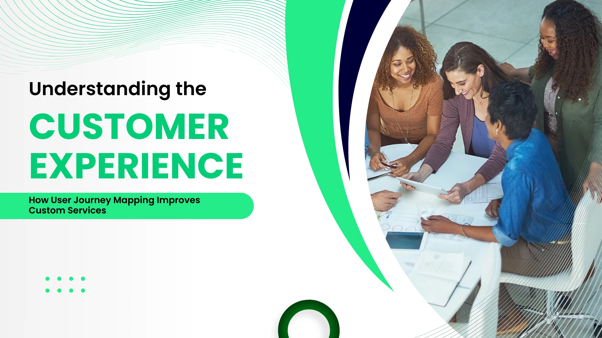
Use images or videos that relate to your course topic. Visuals help explain ideas faster than text alone. Choose clear and high-quality visuals to keep the page professional. Avoid clutter or unrelated pictures. Good visuals make the page more inviting and easier to understand.
Encourage visitors to take the next step with clear buttons or links. Use action words like “Enroll Now” or “Get Started.” Make calls-to-action stand out with color and size. Place them in multiple spots on the page. Strong calls-to-action drive more sign-ups and engagement.
Design plays a vital role in converting visitors into students on your course landing page. Clean, focused design helps visitors find what they need quickly. It builds trust and encourages action. Follow these design tips to increase your landing page conversions.
Keep your layout straightforward. Avoid clutter and too many elements. Use white space to separate sections clearly. Highlight the course title and key benefits. A clean design directs attention to your call-to-action.
More users browse on phones. Ensure your page looks great on small screens. Use responsive design so text and buttons resize properly. Easy navigation on mobile boosts user experience and conversions.
Speed matters. A slow page frustrates visitors and leads to drop-offs. Compress images and minimize code to load your page faster. Test your landing page speed regularly to keep it optimal.
Use colors, fonts, and logos that match your brand. Consistent branding builds recognition and trust. It makes your course feel professional and reliable. Avoid mismatched styles that confuse visitors.
Crafting persuasive copy is key to building course landing pages that convert visitors into students. Clear, simple words help readers understand the value your course offers. The goal is to connect with your audience and encourage them to take action.
Good copy does not just list features. It shows how the course improves lives. It uses proof from real people. It creates a sense of urgency to prompt quick decisions. Each part works together to boost conversions.
Focus on what the course does for the student. Benefits answer the question, “What’s in it for me?” For example, instead of saying “10 video lessons,” say “Learn skills fast with easy videos.” Benefits create desire and show value clearly.
Features explain the course content. Benefits explain the results. Use benefits to tap into your audience’s needs and goals. This approach makes your course more appealing and relatable.
People trust what others say more than ads. Social proof shows that others find your course useful. Use numbers, like “Over 1,000 students enrolled.” This builds trust and lowers doubts.
Include badges, certifications, or success stories. These details add credibility and show your course is worth joining. Social proof helps convert visitors by making the choice safer.
Real words from past students build trust. Testimonials show how the course helped others. Use quotes that focus on results and experiences.
Include names and photos if possible. This makes reviews feel genuine. Honest feedback can answer questions and ease fears. Good testimonials increase confidence in your course.
Urgency pushes visitors to act now. Scarcity makes the offer seem limited. Use phrases like “Enroll before spots run out” or “Offer ends soon.”
This tactic reduces hesitation. It encourages quick decisions. Urgency and scarcity motivate visitors to sign up instead of delaying or leaving.
Optimizing user experience is key to creating course landing pages that convert visitors into students. A smooth, clear, and trustworthy experience keeps visitors engaged. It helps them focus on what matters most — signing up for your course. Small changes can make a big difference in how users interact with your page.
Distractions pull attention away from your main message. Remove extra links, banners, or pop-ups that do not support your offer. Keep your page clean and focused on the course details and call to action. This helps visitors stay on track and understand the value quickly.
Simple navigation helps visitors find what they need without confusion. Limit menu options and avoid complex structures. Use clear buttons and labels that guide users toward signing up. Easy navigation reduces frustration and increases the chance of conversion.
Long forms discourage users from signing up. Ask only for essential information like name and email. Shorter forms load faster and feel less overwhelming. This lowers barriers and improves form completion rates on your landing page.
Trust signals reassure visitors about your course quality. Add testimonials, reviews, or logos of well-known partners. Display secure payment badges and refund policies clearly. These elements build confidence and encourage users to take action.
Building course landing pages that convert involves more than just good content. Using the right tools and templates can simplify the process and boost your success. These resources help you create pages that attract visitors and encourage sign-ups without needing advanced design skills.
Tools and templates save time and ensure your landing page looks professional. They offer features tailored to highlight course benefits clearly. Leveraging these options helps maintain focus on your course goals and improves user experience.
Landing page builders provide easy drag-and-drop interfaces. They let you add images, text, and buttons quickly. Many builders include features like mobile optimization and fast loading times. These tools reduce the need for coding knowledge and speed up page creation.
Popular landing page builders include Leadpages, Unbounce, and Wix. Each offers templates and customization options. Choose one that fits your technical comfort and budget. A good builder helps keep visitors engaged and guides them toward enrolling.
Templates designed for conversions focus on clear messaging and strong calls-to-action. They use layouts proven to attract attention and keep visitors on the page. Pick templates that suit your course style and audience preferences.
Look for templates that highlight course benefits upfront. Use designs with easy navigation and limited distractions. High-converting templates also include space for testimonials and trust signals. These elements increase credibility and encourage sign-ups.
A/B testing compares two versions of your landing page to see which performs better. Test headlines, images, button colors, and placement. Small changes can lead to higher conversion rates over time.
Run tests with enough visitors for reliable results. Use testing tools built into your landing page builder or third-party software. Analyze data regularly to understand what works best for your audience.
Email automation connects your landing page to email marketing tools. This setup sends welcome messages or course details automatically after sign-up. It keeps new leads engaged without manual effort.
Set up automated sequences to nurture leads and encourage course completion. Use tools like Mailchimp, ConvertKit, or ActiveCampaign. Integration ensures smooth communication and builds stronger relationships with your students.
Driving traffic to your course landing page is essential for gaining students. Without visitors, even the best page cannot convert. Focus on multiple channels to attract the right audience. Each channel offers unique ways to reach people actively seeking courses.
Paid ads deliver fast and targeted traffic to your landing page. Platforms like Google Ads and Facebook Ads allow precise audience targeting. Set a clear budget and track results carefully. Use compelling headlines and clear calls to action in your ads. Test different ads to find what works best. Paid advertising helps reach people beyond your current followers.
SEO brings organic visitors through search engines like Google. Optimize your landing page with relevant keywords related to your course. Use keywords in titles, headings, and meta descriptions. Create high-quality content that answers common questions. Fast loading speed and mobile-friendly design improve rankings. Building backlinks from trusted sites also boosts SEO. Organic traffic grows steadily over time with good SEO.
Social media platforms connect you with potential students directly. Share engaging posts about your course benefits and updates. Use images, videos, and testimonials to attract attention. Engage with followers by answering questions and responding to comments. Join groups or communities interested in your course topic. Consistent posting keeps your course visible and builds trust.
Influencers have loyal audiences that trust their opinions. Partner with influencers related to your course topic to reach new learners. Ask them to review or mention your course on their channels. Choose influencers whose followers match your target audience. Collaboration can include guest posts, interviews, or social media shoutouts. Influencer support adds credibility and expands your reach effectively.
Measuring and improving conversions is key to the success of your course landing page. Without tracking results, you cannot know what works or what needs change. Careful measurement helps you focus on actions that increase sign-ups.
Improving conversions is a cycle. First, collect data. Then, analyze it. Next, gather user feedback. Finally, make changes based on what you learn. This process keeps your page effective and growing.
Start by tracking essential metrics like conversion rate, bounce rate, and time on page. Conversion rate shows how many visitors sign up. Bounce rate tells you how many leave quickly. Time on page reveals user interest.
Use tools like Google Analytics or heatmaps to collect this data. These tools provide clear numbers to guide your decisions. Monitor these metrics regularly to spot trends.
Watch how visitors interact with your page. Look for where they click and how far they scroll. See which parts get ignored or cause confusion. This shows what attracts or repels users.
Heatmaps and session recordings help you see user actions in detail. You can find barriers to conversion and fix them. Understanding behavior helps improve user experience.
Ask your visitors for their opinions. Use surveys, polls, or simple feedback forms. Their insights reveal problems you might miss. Feedback points out unclear text or missing information.
Encourage honest answers by keeping questions short and simple. User feedback is a direct source of ideas for improvement. It builds trust and shows you care.
Use your data and feedback to make changes. Test new headlines, images, or calls to action. Run A/B tests to compare versions. See which change improves conversion.
Keep improving in small steps. Each update should move your page closer to your goals. Data-driven changes lead to better results and more course sign-ups.
Credit: themeforest.net
Credit: www.learnworlds.com
A course landing page converts well by having a clear headline, engaging copy, and a strong call-to-action. It should highlight benefits, use social proof, and load quickly to keep visitors interested and drive sign-ups effectively.
Design a high-converting landing page with a clean layout, compelling visuals, and easy navigation. Use contrasting colors for CTAs and ensure mobile responsiveness to maximize user engagement and conversions.
Include a strong headline, course benefits, instructor credibility, testimonials, and a clear call-to-action. Adding a video or demo and addressing FAQs can also increase trust and conversion rates.
Use relevant keywords in titles, headings, and meta descriptions. Optimize images with alt tags, ensure fast loading times, and create quality, engaging content to improve search engine ranking and attract organic traffic.
Building course landing pages that convert takes clear focus and simple design. Use strong headlines and easy-to-read text. Show course benefits clearly and add trust signals like reviews. Make the call to action obvious and easy to find. Test different versions to see what works best.
Keep improving your page based on real user feedback. Small changes can lead to better results. Stay patient and consistent. Your efforts will pay off with more sign-ups and happy learners.


Leave A Reply Now