


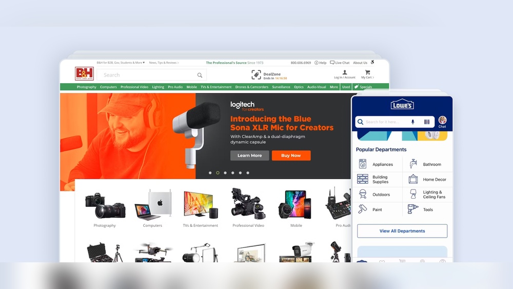
When visitors come to your website, the way they find what they need can make or break their experience. Imagine this: your categories and navigation act like a map guiding your users smoothly through your site.
If this map is confusing or cluttered, people get frustrated and leave. But when your navigation is clear and your categories are well-organized, you make it easy for your users to explore, discover, and engage with your content. You’ll learn simple yet powerful ways to improve your categories and navigation to create a better user experience.
Ready to turn your site into a place people love to browse? Let’s dive in.
Credit: baymard.com
Categories play a vital role in user experience (UX). They organize content logically. This organization helps users find information quickly. Clear categories reduce confusion and frustration. They guide users through a website or app smoothly. Good categorization improves navigation and overall satisfaction.
Clear categories make browsing easier. Users understand what each section contains at a glance. They save time by avoiding endless searching. Clear categories also help users trust the site. They feel confident they will find what they need. This boosts engagement and repeat visits.
Hierarchical categories have multiple levels. Main categories break into smaller subcategories. This helps organize large amounts of content. Users can drill down step-by-step. Flat structures list categories without levels. This suits smaller sites with less content. Both have advantages depending on the content size and user needs.
Categories group content broadly. They show major topics or themes. Tags label content with specific details. Tags help users find related items across categories. Categories create structure; tags add flexibility. Using both improves content discovery and UX.
Navigation types shape how users explore a website. Clear navigation helps users find information fast. It guides visitors through content logically and efficiently. Different navigation types serve unique purposes. Knowing them improves user experience and site usability.
Global navigation appears on every page. It usually includes main categories or sections. This helps users access key areas quickly. It stays consistent across the website. This navigation type sets the site’s overall structure.
Local navigation focuses on a specific section. It appears within a category or page group. It helps users explore related content easily. Local menus guide users deeper into the site. This reduces confusion and improves browsing flow.
Contextual navigation offers links related to current content. It suggests relevant pages or articles. This navigation type keeps users engaged longer. It provides more value without forcing searches. Contextual links help users discover useful information naturally.
Breadcrumbs show users their location on the site. They allow quick navigation back to higher levels. Filters help users sort content by categories or features. Both improve clarity and control during browsing. They reduce frustration and make finding content easier.
Navigation patterns shape how users explore your website. Clear patterns help users find information fast. They guide visitors smoothly through content and categories. Choosing the right pattern improves user satisfaction and engagement.
Hamburger menus hide navigation behind an icon. They save space on small screens. Users tap the icon to reveal menu options. This pattern works well for mobile devices. It keeps the interface clean and simple. But hiding options can reduce discoverability.
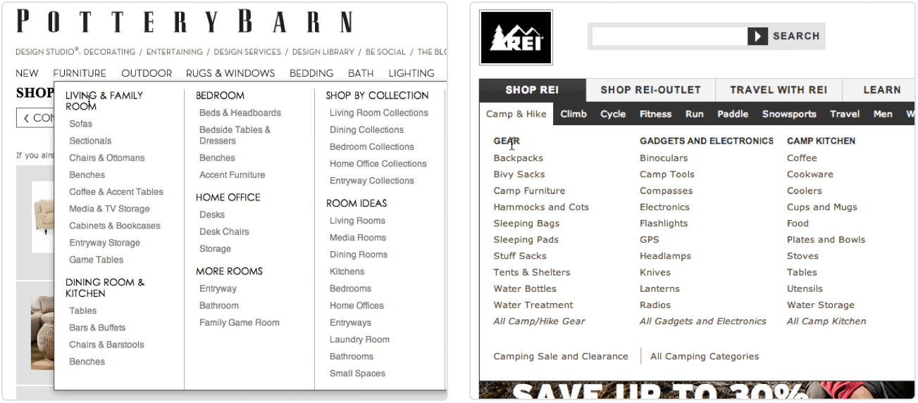
Mega menus show many links at once. They display categories and subcategories in a large dropdown. This helps users see all choices quickly. Mega menus suit websites with many sections. They reduce clicks by showing deep navigation paths. Clear grouping inside the menu improves scanning.
Tab bars display a row of options horizontally. They are common in apps and mobile sites. Tabs let users switch between main sections instantly. This pattern is easy to understand. It offers quick access to top categories. Tabs work best with a limited number of items.
Sidebar navigation places links vertically on the page side. It stays visible while scrolling. This pattern suits desktop sites and complex structures. Sidebars can show multiple category levels clearly. It allows quick navigation between sections. Users can explore without losing context.
Navigation design shapes how users explore your site. Clear navigation guides users smoothly to their goals. Good design reduces confusion and improves satisfaction. It creates a seamless journey through your content. Focus on simple, clear, and user-friendly principles. These principles ensure users find what they need quickly. Navigation must feel natural and easy to understand. Consider different user needs and devices for best results.
Users expect navigation to behave the same on every page. Keep menu placement consistent across the site. Use familiar icons and labels so users know what to expect. Predictable navigation reduces frustration and speeds up browsing. Consistency builds trust and helps users learn your site faster. Avoid sudden changes in navigation style or structure. Maintain the same order and format for categories and links.
Simplify navigation by limiting choices to avoid overwhelm. Use clear, simple labels that match user language. Group related items together to help users scan quickly. Avoid deep or complex menu structures that confuse users. Use visual hierarchy to highlight important links or categories. Reduce distractions around navigation areas to keep focus. Let users find what they need with minimal effort.
Design navigation to be usable by all people, including those with disabilities. Use keyboard-friendly menus that users can tab through easily. Provide clear focus indicators for links and buttons. Ensure good color contrast for text and backgrounds. Include descriptive labels for screen readers to explain navigation elements. Avoid relying only on hover effects for important actions. Test navigation with accessibility tools regularly.
Navigation must adapt smoothly to all screen sizes and devices. Use collapsible menus or icons like hamburger menus on small screens. Keep touch targets large enough for easy tapping on mobile. Prioritize important links for smaller screens to avoid clutter. Ensure fast load times for navigation elements on any device. Test navigation across devices to confirm ease of use. Responsive design keeps navigation functional everywhere.
Navigation plays a key role in how users engage with a website. Clear and simple navigation helps users find what they want quickly. This boosts satisfaction and encourages them to stay longer. Thoughtful navigation design guides users smoothly through categories and content. It reduces frustration and increases interaction. Below are ways to enhance engagement through better navigation.
Focus on what users need most. Structure navigation around their main tasks. Show popular or important categories first. Remove distractions that do not serve user goals. This creates a straightforward path to content. Users appreciate quick access to relevant information. Keep menus simple to avoid confusion.
Customize navigation based on user behavior or preferences. Show recently viewed or recommended categories. Use data to highlight content that matches interests. Personalized menus make the experience feel more relevant. This encourages users to explore further. It builds a connection between user and site.
Filters help users narrow down choices quickly. Use clear labels that everyone understands. Allow multiple filter options to combine results. Place filters in visible, easy-to-use locations. Avoid overwhelming users with too many choices. Well-designed filters speed up finding the right content.
Use size, color, and spacing to guide attention. Important categories should stand out clearly. Group related items together for easier scanning. Avoid clutter by limiting the number of visible options. Clear fonts and icons improve readability. A clean layout helps users focus on navigation.
Usability best practices form the backbone of effective categories and navigation design. They ensure users find what they need quickly and easily. Good usability reduces confusion and frustration. It makes the browsing experience smooth and enjoyable.
Applying usability principles improves user satisfaction and engagement. It also boosts the overall performance of your website or app. Clear, simple navigation helps users focus on content and actions. This section highlights key usability practices to optimize categories and navigation.
Labels should clearly describe the category or link destination. Use words that users expect and understand. Avoid vague or overly broad terms. Clear labels guide users directly to their goals.
Consistent terminology across the site reduces cognitive load. Users can easily predict what each label means. This clarity speeds up navigation and improves task completion rates.
Jargon confuses users and creates barriers to navigation. Use everyday language that your audience knows well. Simple words help users find categories without guesswork.
Write labels for a general audience, not experts. Avoid technical terms unless your users are specialists. This approach keeps navigation accessible and user-friendly.
Usability testing reveals how real users interact with your navigation. Test with diverse users to catch different issues. Observe where users hesitate or get lost.
Iterate based on feedback to improve labels and structure. Small changes can make a big difference in usability. Regular testing ensures navigation stays effective as content grows.
Fast navigation enhances user experience and retention. Slow-loading menus frustrate users and increase bounce rates. Optimize your site to load categories and pages quickly.
Use lightweight code and efficient queries. Reduce unnecessary scripts and images in navigation areas. Speed keeps users engaged and encourages deeper browsing.
Examining real-life examples helps understand the impact of categories and navigation on user experience. Case studies show practical applications and results. They reveal how different industries solve common navigation challenges. These examples guide design decisions and inspire improvements.
Online stores use clear categories to help shoppers find products fast. Amazon divides items into broad groups like Electronics and Clothing. Subcategories narrow choices, such as Men’s Shoes or Mobile Phones. Filters like brand and price let users refine results quickly. Good category navigation reduces search time and boosts sales.
Software platforms need intuitive navigation for complex tools. Slack uses a sidebar with distinct sections for Channels, Direct Messages, and Apps. Clear labels help users switch tasks without confusion. Simple, logical menus increase user efficiency and satisfaction. SaaS navigation focuses on ease and speed of access.
Mobile sites and apps face space limits. Hamburger menus hide options but keep screens clean. Bottom navigation bars offer quick access to main features. Instagram uses icons for Home, Search, Reels, Shop, and Profile. Mobile navigation balances simplicity with functionality to enhance usability.
Top websites feature navigation bars that guide visitors clearly. Apple’s menu highlights product categories with dropdowns for quick browsing. Clear text and consistent placement build trust. Effective navigation bars reduce bounce rates and improve user engagement. They provide an easy path to key site areas.

Credit: www.nngroup.com
Credit: www.smashingmagazine.com
Categories organize content clearly, helping users find information quickly. They reduce cognitive load and improve browsing efficiency by grouping related items logically.
Good navigation guides users smoothly through a website. It enhances usability, reduces frustration, and increases engagement by making content easy to access.
Use clear labels, consistent placement, and intuitive structure. Prioritize simplicity, ensure responsiveness, and keep navigation accessible on all devices.
Categories offer hierarchy and clarity, while tags provide flexibility and cross-linking. Choose based on content complexity and user needs for optimal UX.
Clear categories and smooth navigation boost user satisfaction. Users find what they want faster. This reduces frustration and increases time spent on your site. Keep categories simple and navigation intuitive for best results. Regularly test and update your design based on user feedback.
Good structure helps visitors explore without confusion. Focus on clarity, consistency, and ease of use. A well-organized site creates a positive experience that encourages return visits. Small improvements in categories and navigation lead to big UX gains.


Leave A Reply Now